Trending
Opinion: How will Project 2025 impact game developers?
The Heritage Foundation's manifesto for the possible next administration could do great harm to many, including large portions of the game development community.

Featured Blog | This community-written post highlights the best of what the game industry has to offer. Read more like it on the Game Developer Blogs or learn how to Submit Your Own Blog Post
Everybody's buzzing about Firewatch, but nobody seems to be talking about one of the best bits of the game's design: the map.

Campo Santo made its debut this week with the launch of Firewatch, which aims to capture, in part, some of "the beauty and the aloneness" of the Wyoming wilderness in a pre-smartphone era.
I think it works, and judging by the game's warm critical reception I'm not alone. But while plenty of praise is being heaped on Campo Santo and publisher Panic this week for their efforts, nobody seems to be talking about what I think is one of the best bits of Firewatch's design: the map.
That makes it a bit of a hidden gem, in my eyes, so I thought it might be fun to spend a moment digging into what makes it one of the Best Maps In A Video Game (That I've Ever Played, At Least, Though Maybe You Know Some Better Ones! Do share, if that's the case.)
Because, while I am in no way a game designer and would never purport to be one, I do have an outsized fondness for maps and map design that may help bring to light a minor but meaningful bit of game design that might otherwise go overlooked.
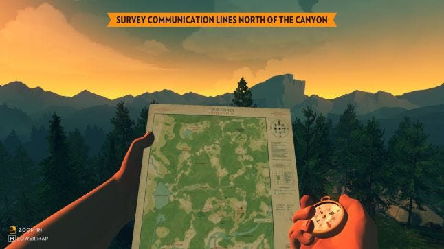
First off, the Firewatch map is not a menu screen or a HUD element -- it’s rendered in the world, and when the player hits the map key they see the hand and thick, fuzzy arm of protagonist Henry hoist it into view with a satisfying crinkle.

It's an old trick (if you’re familiar with Far Cry 2 or Metro 2033, you already know what I’m talking about here) but a good one for immersing players in the fiction, because people in the '80s didn't tap a button to bring up a map screen -- they looked at a piece of paper.
What's more, when the player tells Henry to pull out his map it’s not exactly easy to read -- at least, it wasn’t for me. It's just a bit too far from the camera, affording a broad overview of the lay of the land but ensuring most details are too blurry to make out.
Ah, but the player can hold another key to zoom in, and in those moments it’s easy to picture middle-aged Henry squinting as he brings the paper closer to his nose.
That’s an almost unconscious act of characterization I did there, and it's ripe with potential for eliciting empathy. Not every player will sympathize with Henry in these moments, as I did, but they'd never even have the chance to do so if Firewatch had been designed with a typical (and efficient!) map screen/minimap combo.

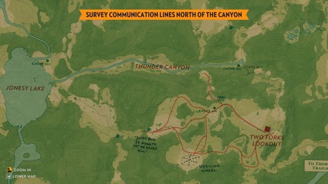
Different players will see different notes on their maps, each tailored to the way they play Henry
Of course, spending development time to render something like that would be less than ideal for many games -- imagine forcing Arkham Knight players to pull over so Batman can reach into the dash and pull out the Gotham road atlas! (Although, actually…)
But Firewatch is a good example of how and where that investment can pay big dividends. Put simply, the map in Firewatch reflects Henry’s personality in a minor but meaningful way.
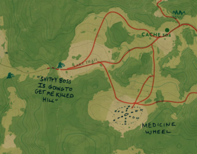
As the player makes choices that help define who their Henry is, scribbled notes begin to appear on the map that are customized to match those choices. The notes on my Henry's map wound up being pretty straightforward with a smattering of goofiness, for example, but you might play Henry with a bit more wit and wind up with a map coverd in sarcastic scrawls.
Either way, as the game moves forward the map in Firewatch evolves and changes in a way that effectively mirrors the protagonist’s own shifting thoughts and feelings.

Great job, Henry
That’s a canny bit of environmental character-building, something I think many developers of first-person games gloss over -- presumably because it's seductive to think there's no better way to know a person, to empathize with them as a person, than to see through their eyes and dictate their every action.
But you can, and Firewatch proves it. Moreover, I think this game is proof that effort expended on such a seemingly minor detail of your game's design can be worth it -- I played through this whole game in two sittings and the number one thing I can't stop talking about is the map.
There are lots of other design decisions worth talking about, of course, and in the days ahead I'm confident many will do so. Most probably won't even mention the map, and that's okay! Doodles on an in-game object aren’t the primary means of storytelling in Firewatch -- here, as is so often the case, the map is not the territory -- but they do offer unexpected and welcome perspective on both Henry’s inner world and the hinterlands of Wyoming where he takes refuge from the outside world.
Incidentally, if you're playing Firewatch yourself I encourage you to open the Settings menu and uncheck the option to "Show location on map." It may make the game a bit trickier to get around, at least at first, but I think* it's worth it for the added pressure it puts on you to study the terrain and learn to navigate by landmarks.
* I was also one of those Boy Scouts who really enjoyed the Orienteering merit badge, so YMMV
Read more about:
Featured BlogsYou May Also Like