Trending
Opinion: How will Project 2025 impact game developers?
The Heritage Foundation's manifesto for the possible next administration could do great harm to many, including large portions of the game development community.

Featured Blog | This community-written post highlights the best of what the game industry has to offer. Read more like it on the Game Developer Blogs or learn how to Submit Your Own Blog Post
Slides and notes from a talk I did at the London Game Space. The subject matter is tutorials and the film Memento: How do we get people to figure things out for themselves?

The following are the slides and flash-card notes I used for a talk I gave at the London Game Space for a "Petcha Kutcha" night. The talk was structured as 20 slides at 20 seconds per slide. I've added hyperlinks to the notes where relevant for further reading or simply finding the games.
There's no audio/video as yet of the talk. And to be honest I don't remember much of performing it apart from struggling with the timing. Enjoy:

At the beginning of a game we have no context, no grasp of what went before. At some point we must tell the player about John G. But they must believe that finding him has a meaning. That's something they can only do for themselves.
Thank you. That was my talk on Tutorials.
You can follow me on twitter at S T 33 D.

You can be obscure and have it all laid out backwards to confuse people, but it's nice to have the odd clue to follow as well. It's why the tattoos in Memento are so compelling, it's a tutorial but we're invested.
Guy Pierce is indeed stuck in a tutorial, but he believes it has a meaning.
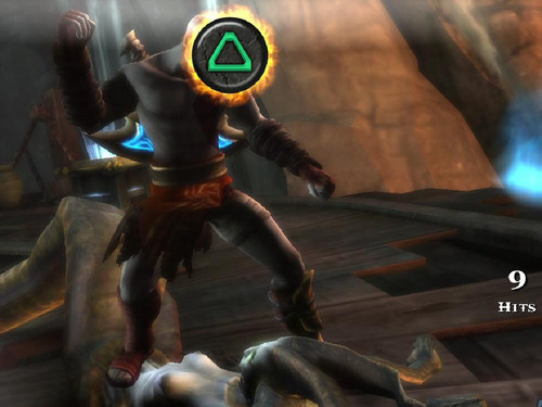
And this is what quicktime events should be - and have been. It's an opportunity to telegraph gameplay concepts to the player. That when X means yes, then yes, yes, yes that guy to death over there. Don't be ashamed to use them if you want wacky gameplay. Do be ashamed if your event has the same level of engagement as installing an operating system.

And when I say foreboding barrier I don't mean this. This warning before interaction has no respect for the user's time. They want to be entertained and you've given them is the dreaded wall of text. If your game is not about reading then you should never see something like this. You're making a saving on localisation.
In many cases text can be replaced with animation.

Sending the player through a tunnel is like presenting them with a gate. In avoiding pop ups we often opt for a gate in the game world. Gates are a black and white choice. And this is important in understanding why players aren't reading pop ups, they don't have to. The okay button is right there.
If we need a gate it shouldn't be a thing the player can easily dismiss, it should present a forboding barrier.

By funnelling the gameplay we're keeping the player out of trouble until they're ready. I'm not saying you can't do a Dark Soul's graveyard, but even Dark Soul's has an easier path to take.
Remember however, funnel, not tunnel - if there is only one path through a puzzle it becomes a chore to play it again. You want to encourage experimentation.
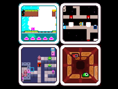
So what have I done? For Nitrome I made a series of icon games. Games in 50 by 50 pixels. I couldn't put a pop up in there even if I wanted to. Oh, scrolling text you say? There's a reason no one uses marquee tags in html without irony.
We went with the simple truth: At some point the player will experiment with the cursor keys. We give them just enough wiggle room and then the amount of options over time grows like a funnel.
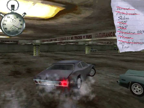
Driver by Reflections Interactive on the PlayStation 1 had perhaps the best and worst tutorial at the same time. It's a balls hard checklist of stunt driving that you have to complete in 60 seconds or you don't get to play the game at all.
I would generally shy away from such a punitive exam but I have to admit you feel like a driving god after you complete it.
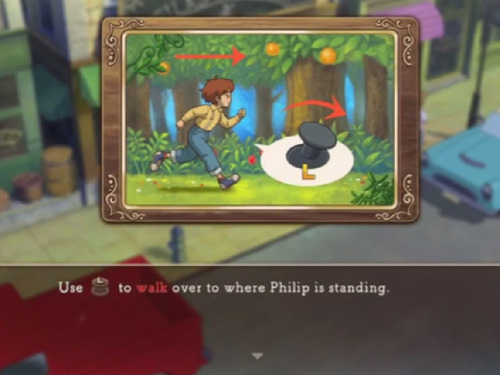
Ni No Kuni. Aside from the fact that I spent 45 minutes watching a Let's Play that failed to evolve beyond a reaction video for the never ending cutscene, I saw pop ups like these.
Why have they done this?
Why would I not know what a joystick does?
The QA tester's have fallen asleep, that's why. If you have to tell the player they're holding a game pad then something has gone horribly wrong.
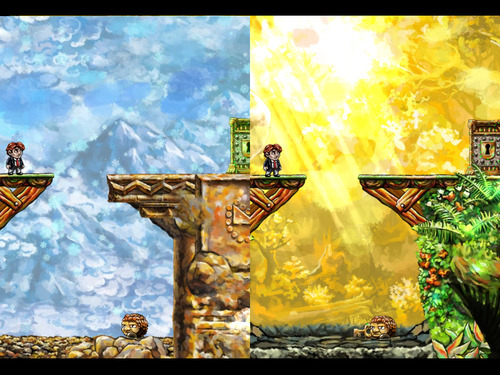
Braid also recycles level design to teach new mechanics. This is good too. I just can't stand the bloody riddle-like puzzles later on. Riddles are the one thing I hate more than jigsaws.
(I'll admit I played the shit out of Alexey Pajitnov's Pandora's Box though when I was a kid - that's an exception). Now lets look at a bad example.
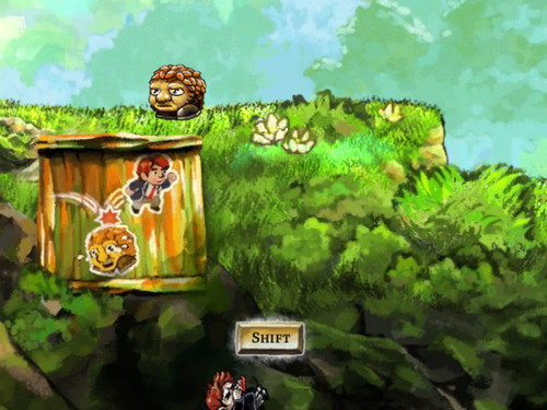
Still, it would have been fucking nice to know that you can float.
When I thought of putting Braid into the talk I forgot how many bloody signs there are on the first level. So let's ignore that for a second to appreciate a couple of things it does very well. The first death breaks immersion by telling the player about the rewind button. This is the perfect time to tell the player about this mechanic.
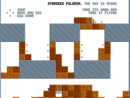
Although I've been pointed to Droqen's Starseed Pilgrim as an example of implicit learning, the starting screen still has instructions for moving and digging. Only when you fall into the game world does any instruction vanish. Even to the point of not telling you there is another very useful action on the keyboard.
For some starting the game, a wall is a wall until they are told explicitly to walk into it.
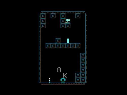
The first screen of Fjords by Kyle Reimergartin instructs the player through a phone that shakes out keyboard letters. The two fold symbolism of sending a message and encouraging experimentation is wonderful. Which is wholly appropriate before you start to hack the game.
It's just a shame I hate pastiches of the DOS command line in games. It just gives me flashbacks of uselessly trying to connect to my router on Windows 95.
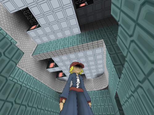
Sophie Houlden's Sarah's Run has a lovely twist on the level select area. On the ceiling are gates to the highest levels. These appear unreachable until perhaps some action on early levels has unlocked a bridge. But the bridge exists only in the player's mind. Once they have learned how to run up walls and change gravity they can access any level they like.
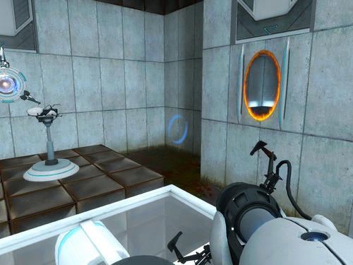
Portal. And I know we keep coming back to Portal but look at the structure of the game and ask yourself, "what is the tutorial?" You don't even get control of orange portals till chamber 11 of 19. And then you're still in that that constrained environment almost right till the end when it finally let's you freestyle.
Portal blurs the line between control and agency. Your game should do this too.

Like Mario, Megaman was made to be economical in education. YouTuber Egoraptor waxes lyrical about how it stands out among other games. He repeatedly illustrates how the game telegraphs vital information to the player without an annoying sidekick interrupting the fun.
I recommend watching his video as further research. Just turn your volume down before you do so.
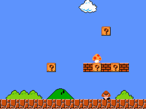
Anna Anthropy's article To the Right, Hold on Tight is an excellent examination of how Mario implicitly teaches game mechanics. You should read it. As someone who has tried to transcribe Mario's mechanics into a turn-based format I can tell you in great detail how much more nuanced the game is that you realise.
It is a game you should study.
Let's look at some more homework:

When we see writing or signs we know something is wrong. We have a clear intrusion into our basic reality. It breaks immersion and becomes an issue of control. We do this all too often in video games to get the player to play the game. Are there other ways? Let's start with Super Mario Brothers.
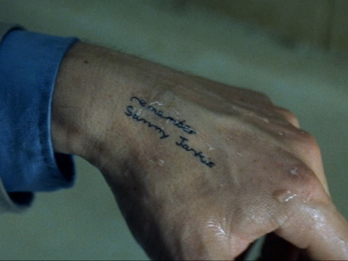
He starts each scene staring into space before being presented with a clue. This drives the plot. His every next move is sign posted and the questionable reliability of these clues becomes more and more central to the story.
It's a story about control and agency.
But what I see is a guy permanently trapped in a tutorial.

In the film Memento we are introduced to Guy Pierce covered in his own tutorial. He has no short term memory and must start each scene with no guidance except his tattoos, his notes and his wavering trust in the people around him.
To allow the audience to sympathise with Guy, the film's story is told backwards over intervals. Each scene is the story of what happened previously.
-
Hello, I'm Aaron Steed and today I'd like to talk about tutorials.
Read more about:
Featured BlogsYou May Also Like