Trending
Opinion: How will Project 2025 impact game developers?
The Heritage Foundation's manifesto for the possible next administration could do great harm to many, including large portions of the game development community.

Featured Blog | This community-written post highlights the best of what the game industry has to offer. Read more like it on the Game Developer Blogs or learn how to Submit Your Own Blog Post
Recently, I've prioritized unusual things such as menus & a tutorial over developing gameplay features or producing content. Here I explain how and why my approach of taking the game to as many game shows as possible drove these decisions.

(Original blog post) In recent weeks, I've prioritized some unusual aspects of my game over developing gameplay features or producing content. Specifically, I've worked on:
a swear-word filter
menus
a tutorial
Those are all things that usually tend to get taken care of at the end of production, afaik. The reason why I've chosen to do this is that for MODSORK, my marketing strategy consists of exhibiting at lots of events and sending in the game to any competition I can find. ( Marketing is far from the only reason for me to attend game events, but I've written about that elsewhere ). Here's how this has driven the development of said features so early in the project:
1. The Swear-word Filter
Leaderboard
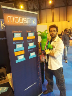
Since MODSORK is an arcade game, it needs leaderboards. Previously, I'd done those physically and it had proven to work great at game events, creating some fun rivalries between visitors and providing photo opportunities to commemorate taking top spot as well as conversation opportunities ("Whoa, how did somebody score so many points?").
At the Ludicious Festival in Zurich, I wasn't able to attend the booth at all times and handle a physical leaderboard, so I implemented a simple one in the game. It allows only short player names of 3 characters, like classic arcade machines, but that already provides ample opportunities for profanity. Now, it wasn't a big event and the main audience rather was mature. Profanities in the leaderboard wouldn't result in people getting shocked, I assumed. Still, I built in a little filter that reacts with somewhat humorous responses to attempts at entering swear-words.
Playfulness
The way I see it, it's like a hidden mini game. Once a player tries to enter something naughty, the fact that the game acknowledges that and reacts to them is hopefully a pleasant surprise that inspires playfulness. Some folks will even see it as a challenge and start trying to trick the filter with creative spelling. If they manage to do so, they get to feel smart about themselves, if not, they can still be amused at the variations that the designer predicted.
The same of course goes for gatekeepers that check submissions for competitions and limited festival booth spots: With a bit of luck, they'll spot it and see it as a pleasant bit of extra depth. I am actually not sure if anyone has noticed the swear-word filter yet, but sooner or later somebody will and it didn't take much time or effort to build.
2. Menus
Consistency in Design
My goal is to create a consistent and seamless experience with MODSORK. I want the menus to be a part of the game, rather than just something you have to wade through to get to the actual game. Therefore, I decided to make them as coherent as possible with the main game:
The same color coding applies,
players use the same controls to navigate and the same controller buttons to perform actions.
Activating a menu button looks & sounds like zapping an item in the game.
The menu items are on a "wrap-around" list, same as the arena wraps around its edges.
I have plenty of ideas how to make stuff like transitions to sub-menus and adjusting sliders similarly consistent in the future. Also, the music will transition seamlessly between menus and the game without missing a beat.
Facilitated Learning
While saying that the players already start learning how to play the game by navigating the menu is a bit much, but they are primed in some ways by encountering rules and information that will apply later. My hope is that this will make learning the game easier and possibly lead to more "spontaneous" discoveries of how things work.
Internal Coherence vs. Global Conventions
In MODSORK, internal coherence means using LT/RT/LB/RB instead of the usual A and B (X and Circle) buttons for the menus. Eschewing such established control schemes comes at a cost. It's not a fun challenge to have to actively think about which buttons to press to activate a menu item, it's an irritation. However, I decided to accept that initial irritation for the sake of purist coherence, while trying to mitigate it with clear communication and a menu option to switch to traditional controls for those that just can't get used to it.
 Pressing a wrong button brings up a graphics howing which buttons to use instead.
Communicating Future Scope
Last but not least, greyed-out menu buttons and their corresponding info texts communicate future features (c.f. picture above). The beneficiary of that info could for instance be a gamer on the show floor spotting upcoming alternative game modes that I haven't been able to tell them about because I'm on a bathroom break. Or it could be somebody reviewing submissions and who maybe only skimmed the lengthy description text after reviewing the 10th game demo that evening.
3. Pre-Game Tutorial
Because of its unconventional and challenging controls, MODSORK always had a pre-game phase where players could experiment and familiarize themselves with the controls. Later I added Help-screens describing goals, basic principles and the control scheme. After a great conversation with a fellow developer at Casual Connect ( another benefit of attending events ), I took it further and used that pre-game stage to teach the player about basic rules of the game.
Here, too, I made sure to make player actions as playful and consistent with the main gameplay as possible, e.g.
players now start frenemy spawning by zapping an object like you would in the game, instead of pressing an otherwise unused button.
they can go back to the main menu and the help screen by physically traveling there with one of their avatars.
Trade-offs and Solutions
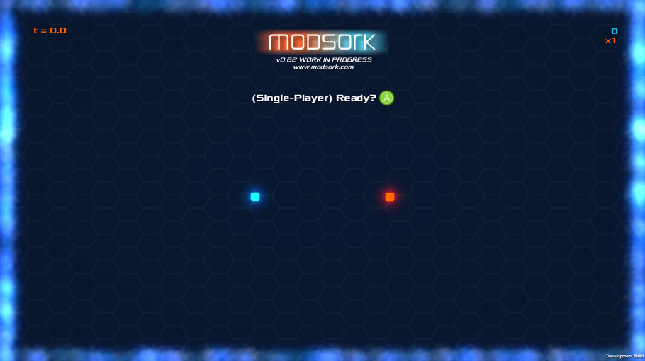
Adding all those elements has made the pre-game screen less attractive. Before, the pre-game screen seemed to make show visitors curious and its simplicity seemed appealing.

A pleasantly minimal early version...
Newer iterations don't look as inviting and it does seem to me that now at game shows more people decide not to engage with it after a glance at the screen.
My solution will be to build in an attract mode that plays a gameplay video when nobody is engaging with the game. Of course, the pre-game screen will still require many iterations until it communicates just the right amount of information for new players to have a smooth start, even after freeing it from its "attraction" function.
Early User Testing
The tutorial is a critical part of the game, especially for users who haven't fully committed to it yet by spending money ( e.g. f2p games, but also game show visitors, journalists, reviewers ). Implementing it early gives me loads of user testing opportunities ( another great thing about exhibiting at game shows ).
Let's face it, as a solo developer, being overwhelmed with a large variety of tasks is the normal state of things. Now when I imagine what stress levels must be like as you get close to release ( i.e. when you usually develop the tutorial ), there's a very real chance I'd skip some user testing on this crucial element of the game if I implemented it at the very end.
4. Conclusions
It's hard to measure whether these decisions have really payed off. I'm quite happy with the number of times I've managed to get one of those usually limited exhibition spots, but there are without a doubt many other factors that have influenced that. Also, working on these things so early makes it likely I'll have to change them later on when all the other elements of the game are locked down.
However, I have had several people pick up on little details of consistency here or there and they really appreciated them. And working on the tutorial is actually a no-brainer in my case: Due to it's high initial difficulty, it's easy enough to bounce off the game as it is. But once people are aware of all the actions they could perform if they can just pull them off, it's much more likely for MODSORK's addictiveness to kick in.
It will also be a blessing on my voice and nerves when I finally manage to make the game completely self-explanatory and intuitive and I don't have to explain to every show visitor how the controls work... ;) (I've been very hands-on in this regard so far)
If you'd like to check out MODSORK, it'll be playable at the International Games Week Berlin, first in the Quo Vadis Indie Zone, later at Indiecouch's tent in the AMaze Village. Stop by and say hi! :)
Read more about:
Featured BlogsYou May Also Like