Trending
Opinion: How will Project 2025 impact game developers?
The Heritage Foundation's manifesto for the possible next administration could do great harm to many, including large portions of the game development community.
The post-mortem of my first flash title, "Ode To Pixel Days", which was also my introduction to indie game development.

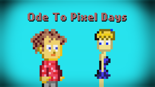
You might want to listen to the OTPD soundtrack while reading this.
So the day has come for me to write down the last words on the game that will always have this special place in my heart, Ode To Pixel Days. Summer of 2012, I've started designing a game about shrinking down to pixels. I’ve tried to imagine ways this mechanic could work interestingly. I decided that I was going to make an action platformer in a similar feeling with Spelunky, because at the time that was what I was going crazy for. (Although I’m still crazy about Spelunky. What a game.) So my game would be about a boy shrinking down and sizing up, so he would have different states of body. And I wanted the states of body to have different abilities. The smaller you are, the less effective you are, because you can’t use the items you would be able to use when you were bigger. You can’t climb that rock once you were able to climb. So I thought it would be a game about using your body states carefully and strategically while you try to beat very hard levels that you often restart. Yeah. If you’ve played the game you know that’s not nearly the exact product that came out.
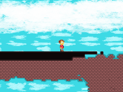
The conflict in my head was that I also wanted to tell an emotional story with it. This story about a boy and a cheerleader came to my mind. It wasn’t something that I lived through in my life but it had very similar feelings of 12 year-old me. So, if you’ve played the game and you still don’t know what it’s actually about, it’s about my mindset when I was around 12, with all the stupidity and having no idea about relationships. So all the comments that say “Hey but Hans is so stupid for doing all these things!”, this one goes out for you: He isn’t supposed to be smart! He is not “perfect”, he is not supposed to be. But I don’t blame you because the game does not specify any age group or anything. It just tells a story and the way it tells is a little bit abstract, so everyone has all the rights to say “This game is stupid”.
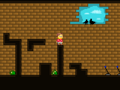
So when I started my internship at Nowhere Studios, they let me do whatever I want and they assured me that they would help me in every way possible, and since I had this inspiration about this game, I started developing it. It was my first serious flash project so I needed to be able to use ActionScript3 well. Flixel helped a lot with this since it solved a lot of harder problems like collision checking for me beforehand.
If you read the game design document I wrote at the time, you see that the game is still an action platformer and has no puzzles and such. Deep down I wanted to make a puzzle game, but I thought I could never design cool puzzles, so I should better make something that feels more intuitive for me to do. But when I started making the game, I wanted to have some spacing between action parts and storytelling parts. I felt that the game needed some puzzles, it would help a lot with the pacing of the game. So just when I started designing puzzles, I thought what the hell was I thinking, trying to make an action game about a cheerleader rejecting a boy. It’s much more sensible making a puzzle platformer about a cheerleader rejecting a boy, right? RIGHT? NO? It still makes no sense doesn’t it?..
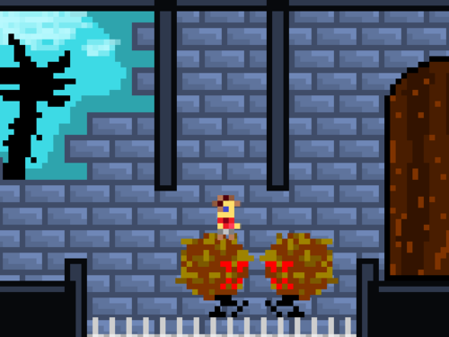
Well I did it anyway. At the end of the internship, I was up to the part where Hans meets a bigger Hans. So I was just about to design the boss battle, which is the last challenge in the game, also the worst? Probably, since it left a lot of people not knowing what to do. Then when the player found out it was a simple “Simon Says” kind of thing, they felt frustrated. What were they doing comparing colors with moving blocks and shit? Fuck this guy and his game, he seems to be a jerk anyway.
I finished the game 3-4 months after the internship. Why did it take so long? Because I was busy with the university and also I’ve done a lot of testing, I wanted it to play as good as possible. So it was now time to put it up on FGL.com. So I did it, expecting at least 2000 dollars for it to get sponsored, but it might easily go up to 5000. At least that’s what I thought would be.
After two painful months of mailing every sponsor that I find on internet and my friends helping me, I finally got an offer for 1000. If it was a few months ago, I would say, “Heh, let it go higher bitch.” But now I was more realistic and I jumped on to it like a horny dog jumping on a plush toy.
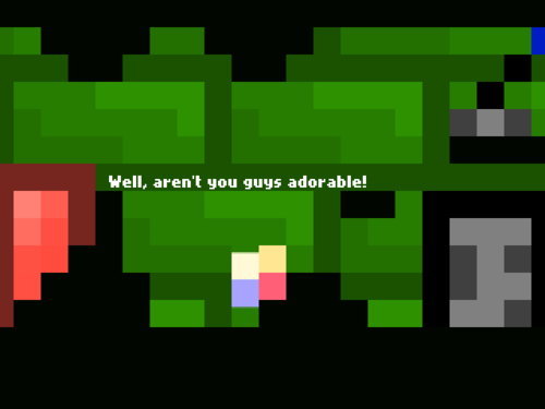
So now, I was waiting for my game to come out, my diamond that I worked on for 7 months. I didn’t know what to expect, everything might just go wrong. And then, the game came out, so did the comments. I didn’t know what I was expecting but I’m sure I wasn’t expecting these:

A… LOT… OF… COMMENTS... LIKE… THIS.
But yeah, it’s the internet, and apparently it’s hard to keep a secret, so they know that I’m just a pretentious prick.
Now I’d like to address a few problems I’ve come through the development and the things that are apparent after watching all these people experience the game.
1. Puzzles weren’t good enough: All the puzzle mechanics were just decided on the way. That left me putting new mechanics that don’t have anything to do with the story of the game, they were just there to make more puzzles. That’s not good, no.
2. Graphics: I don’t know much about graphic design and I think the game shows it with empty walls and some bad color decisions all around. I tried to make it prettier with the castle concept, but I’m afraid it’s still not a good looking game. And at the end of development I was so sick of it, I had no motivation to try making it look better.
3. Narrator is a text object: People instinctively despise reading all the text you’re throwing at them all the time. Stop. People want to play the game, not read. Making a game work with so much text is hard, an example that succeeds is Thomas Was Alone. In my case, I could do it so much better instead of just putting the text up there.
4. Frustration: I have tested the game with a lot of people, changed a lot of puzzles, tried to make it less frustrating as possible. I believe I’ve done a good job, but still I couldn’t make a lot of people feel better about the game and not getting frustrated like they did. I get easily frustrated playing games, so I know it’s a bad feeling.
5. “So are we seriously going back now?”: The thing about the game is that it had such a big chance to explore this utopia it created slowly. What may actually happen in a world full of same-looking people? What would be good, what would go wrong? But instead of doing that, only explaining a single bad side of the world, cheerleader decides to go back and I think some players were left feeling there could be so much more to it, and it didn’t fully explore the possibilities of this relationship.
6. Cheerleader: She doesn’t even have a name, so people thought I was a total jerk on girls. The truth is I didn’t want to tell the story of a girl with a freaky fan of hers, I wanted to tell about the freaky boy and his feelings. So, Cheerleader… It’s not about you, it’s me. Sorry.
So why not continue with bad comments:


A lot of people thought Hans actually committed suicide. Again, abstract story and shit.
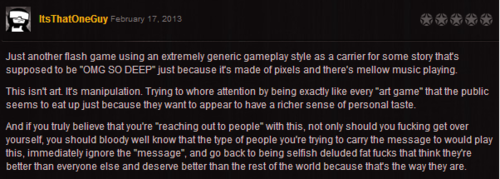
This guy (with a weirdly fitting nickname) made this comment and it broke my heart so bad that I couldn't get over it for days.
Now, let’s talk about the things that actually worked:
1. Story: People loved it. A lot of people felt connected with it. A lot of people told me that I’ve created a truly emotional story, and being absolutely honest about it made it extra special for a lot of people.
2. Music: I’ve actually made 8 dollars out of the soundtrack for no reason. I put it up as Free To Download at first, but some people actually wanted to pay for it, so I made it Pay What You Want. I think it’s a decent little soundtrack and it fits the game quite well. By the way, the inspiration for the soundtrack was the album “Ocean Songs” by the awesome band Dirty Three. I just tried to recreate that kind of ambience. I failed horribly, but it still gave birth to some interesting music.
3. Cheerleader: Although some people didn’t get it, I think she worked well as a good symbol for young males to fantasize about yet she’s not exactly what a guy is looking for in a good relationship. It was just fitting the story very well.
4. Big Hans: This guy told about the feelings of Hans like no other thing in the game did.
5. Overall feeling: I don’t know how exactly I did it, but most of the people who played the game was very into it, thanks to the overall feeling of the game. It was honest, it had decent music, it had cool details. I think these all came together to actually create a nice game overall.
So are you still curious what the reception was like? It wasn’t all bad.
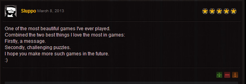
Actually, it was mostly good:

If you go on to Kongregate comment section or Newgrounds, you see that the reception was actually quite awesome!
It was my dream to be on indiegames.com, which became true.
OTPD had a lot of reviews and articles about it. Like this one.
It was life changing.
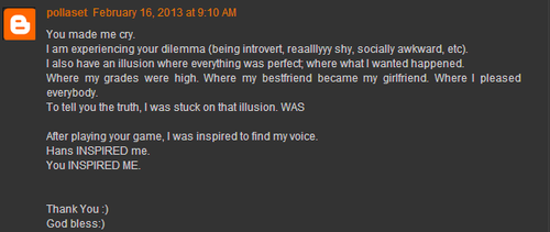

OTPD have been played 250 000 times. A lot of people loved the game and connected with it on an emotional level. It made me feel all these awesome feelings. It’s indescribable really. So I just won’t try to describe it at all. It’s awesome and it still gives me motivation to keep making games. Thank you to everyone who have supported this to come to life. Now I’ve designed a new game and I’m just about to start on a new journey.

Thank you.
Read more about:
BlogsYou May Also Like