Trending
Opinion: How will Project 2025 impact game developers?
The Heritage Foundation's manifesto for the possible next administration could do great harm to many, including large portions of the game development community.

Featured Blog | This community-written post highlights the best of what the game industry has to offer. Read more like it on the Game Developer Blogs or learn how to Submit Your Own Blog Post
An approach to design process based on historical research, creating game aesthetics and mechanics based upon such a research.


Originally published on Made with Unity blog.
There are many different approaches for creating a game, but most of them can be divided in two categories: creating games based or inspired by other games or creating games based in something else entirely.
If you are willing to create a piece of media that replicates other entries of the same genre, you should immerse yourself in those entries and create based on that experience. That's how most AAA games are made, safe games, games that feel like other games selling well right now and thus will sell ok too. However, if you are willing to do something new and unique in some aspect, you must distance yourself from this media and get immersed with other types of creations.
If you want to make something different, focusing on the final product will just upset you; you have to think about the whole process differently.
In 2014 I was brainstorming ways to design a game and thought about art history. While reading about the Rococo movement it just felt right to create a game based on it. Not only inspired by its aesthetics, but actually created from scratch based on what that movement stood for.
Rococo was a time period of excess, elegance and exquisite beauty. It was a statement against the darkness and gloominess of the previous dominate art style, Baroque, and yet a love letter carrying many of its main characteristics, such as intricate ornaments and curved forms. Rococo was not a universal movement, it wasn't even present in all European courts. It was mostly a French movement that did carry some, very short lived, influence abroad.
This is the story of how Rococo VR came to being, its first version. The game currently on the Oculus store evolved from this original concept.
To better understand Rococo, let’s first get into Baroque. Baroque was a deeply religious influenced movement with very manicheistic themes. This is present in paintings and art in general with a strong focus on contrast. Light and shadow, young and old, pretty and ugly. Baroque paintings also featured excess; a lot of movement, many characters, a lot going on. Common themes were Stations of the Cross and the deaths of biblical characters which were painted in great detail and overindulgence of expressions, even though some scenes were quite graphic.
In one word, Baroque was always about drama, and this drama was generally very gloomy and sometimes even morbid.
Rococo took the drama and the excess of details and painted it in a brighter light. Rococo was still about the surplus of ornaments and curvy lines, but where Baroque saw blood, Rococo sees flowers, where Baroque reenacted a fight, Rococo reenacts dance. Everything in Rococo is more delicate and fragile while still being heavily adorned.
Imagine Baroque and Rococo as twin siblings with a taste for rock and fashion. Even though both of them are using the same set of frock coat and waistcoat, Baroque has that spirit of goth while Rococo is in essence very glam. Baroque is always suffering and letting people know what it feels. Rococo only wants to enjoy its life doing as little as possible while boasting about what a nice time it's having. All the while, Baroque has a lot of fun when no one is looking and Rococo cries in the shower because how empty it's life is. You know the story.
Exactly as our imaginary twin siblings, I keep thinking about the ideal lifestyle of enjoyment and carefreeness that the Rococo period encouraged and how it swept everyone's emotions under the rug. No one is happy or sad all the time no matter how hard they try to sell the image. During the Rococo period people still got sick, lovesick, cheated on, and died, just as frequently as in any other time and considering the people who are not the 1%, there was plenty more suffering to go around. Rococo's opulence led France to the verge of bankruptcy. French people were so unhappy with the government they literally hung all of them (it’s called the French Revolution, look it up).
On the surface Rococo is about bright color and flashy details but also beautiful appearances and sweeping dirt under the rug. This conflict, between image and substance is our game.
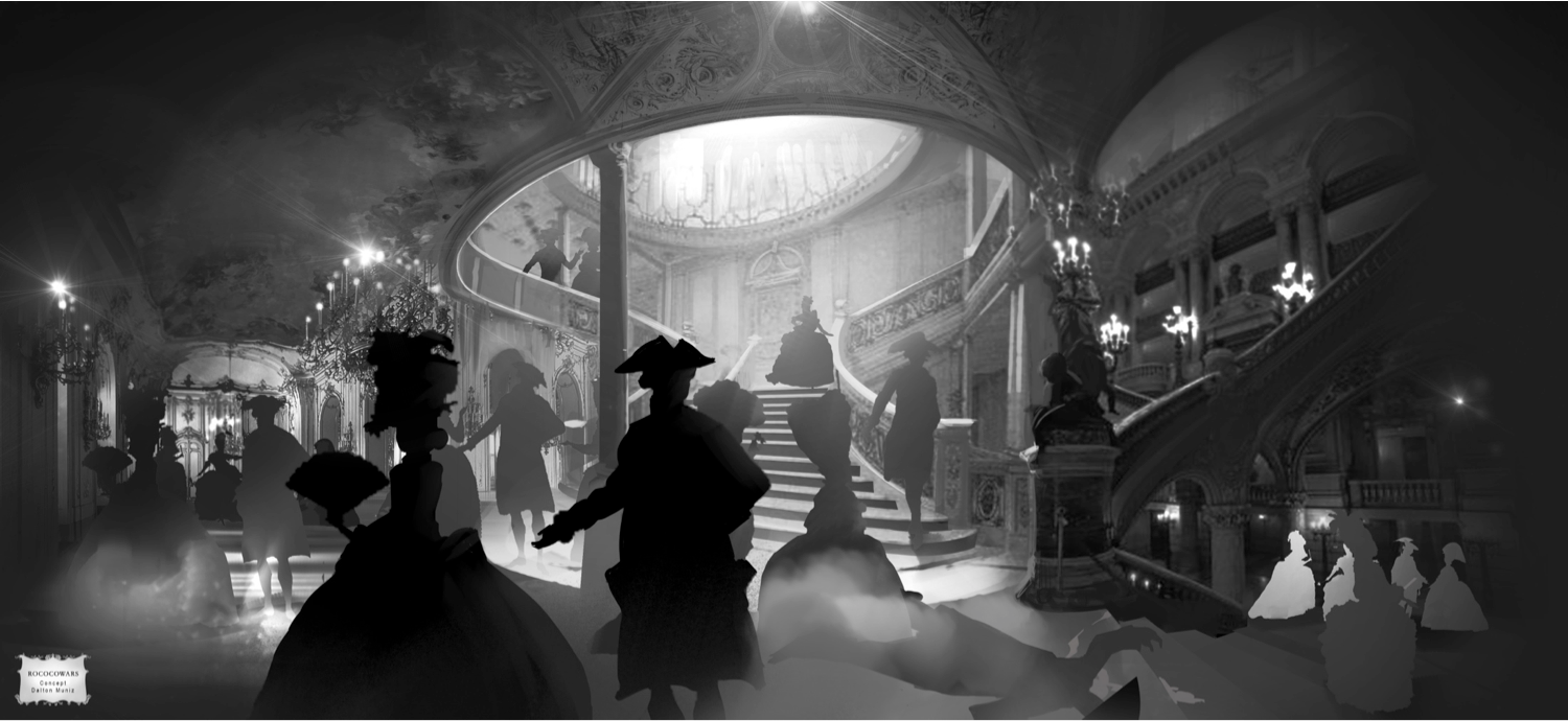
The best moment to express the dichotomy between what was the ideal Rococo period lifestyle and its actual sinister reality in my opinion was the most common venue for people of that time to meet; a party. In this time, there weren’t many public spaces for people in general to go to and do stuff; the streets were filthy, restaurants weren’t common, “jobs” were looked down on. People would meet in the opera, in the theatre, or in big events on private properties. Since the focus of the opera and theatres is the show itself and not the people in it, a private party was the most logical setting for the game.
A private party would have all the artistic elements of the Rococo period: exuberant decoration, intricate dresses, elaborated hairstyles, servants to fill in your every need, so much wealth that you could fill your working class apartment out of it. Again though, that's just the surface; what that time period tried to look like. Something bad needs to happen in this party to start the crack on the appearances of this society, something awful that would be the trigger and motive for the player to understand this world.
So very early in the creative research process we already have the game context in a nutshell:
a party — that sets to the player what is normality in this place;
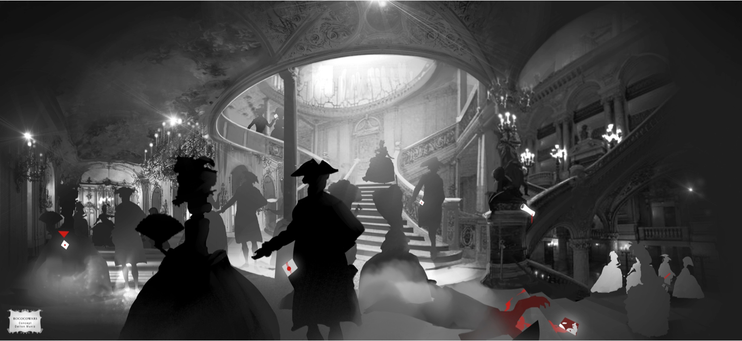
a crime happening in the party — the main conflict and the event that starts ripping off the wall paper;
solving the crime and discovering what all guests are really up to — tearing off completely the normality first presented.
The contrast between appearances and reality and the need to highlight potential clues was my main motivation behind suggesting art to use a black/white/red only. While black and white are the only colours visible in this magical but still frail world, red would taint the crime scene, all intractable objects that might be clues and also people player could talk to.

We now do have the main idea of what the game is about and how it looks like, but nothing on how the game behaves. How exactly does the player discover all this information about other character and the perpetrator a.k.a. what’s the core gameplay?
Solving the crime implies that there is going to have some investigation going on so player must have a way to interact directly with characters and objects. Dialogue is also the best channel for us to explorer the slow but steady decay of perceived moral and high values of all characters in the game. By talking to them, asking question and doubting their answers we give the player full control in who and what to believe in, what lead to follow and whom to ally with.
Unfortunately, this design was lead to a dialogue and interface only game, which in my opinion was too arid for for our team. That's when the customs and pastimes of aristocracy back then started influencing the design. Talking would only get you so far, you needed to engage with characters in certain ways that would make them more willing to share information. Most interactions were short competitions such as a boast contest, a fan dispute (literally, air propellers fans) or a card game, but there would be instances in which a gun duel was to be matched.
Rococo was one of my favorite pitches of its batch (there where around 20 concepts which turned into 6 pitches) but even though it felt amazing, it wasn't picked up for full development. Finding Monsters was and eight months latter we had an amazing game. However, during FM development, there were some periods in which part of our team was idle for short periods of time. For instance, there was the moment in which concept artists haven't yet finished a monster and 3D artists had not nothing on FM to do for a couple of days.
Rococo also intrigued our Art Director, Jesse Sosa, who though this was an interesting visual concept. So, we decided that art team could work on Rococo art while idle in order to make it as an art demo. As an art demo, Rococo was ripped out of gameplay to become something visually striking. Once Finding Monsters was done, so was Rococo and we finally had some engineers and designers to work on it. But then Rococo had already evolved to something else. And that's another story for another day.
Read more about:
Featured BlogsYou May Also Like