Trending
Opinion: How will Project 2025 impact game developers?
The Heritage Foundation's manifesto for the possible next administration could do great harm to many, including large portions of the game development community.

Featured Blog | This community-written post highlights the best of what the game industry has to offer. Read more like it on the Game Developer Blogs or learn how to Submit Your Own Blog Post
SLUDGE LIFE's visual identity was iterated upon throughout development and came to be in a pretty natural and organic way.

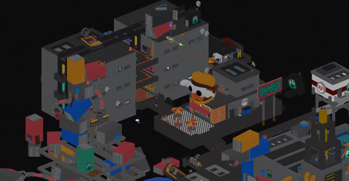
A cold, gray world, colorful tags and weird characters - SLUDGE LIFE’s visual identity was iterated upon throughout development and came to be in a pretty natural and organic way. I was coming off of exploring level design tools to build maps in our previous game High Hell and wanted to try instead to make one big map, focused on exploring the space freely, instead of on combat encounters. Eliminating combat from the get go was the one big defining choice that meant a radical shift in perspective when building the map and trying to make the game as a whole interesting to engage with.
CSG level design tools are usually only used in grayboxing and are quite basic and blocky, but it's a non-destructive workflow which makes iteration fast, and can look chunky in a cool way. The default grayness made the initial sketches feel like concrete brutalist structures. The tagger angle came right with it and it's such a fun premise to start from when building a world. And I’d really just build things as I go, sometimes getting an idea before building a new chunk of the island, sometimes just throwing a bunch of blocks around and seeing what happened. As the space grew a visual language developed as well, with CIGGY the cigarette brand mascot being the lead icon, but backed by the antagonist corp, GLUG. A lot of it came by chance, the image of the GHOST, for example, the tag used by the player, came from a ghost sprite I had made for another prototype I had played with earlier.

https://www.youtube.com/watch?v=Cv1eNdjxnrY
The lofi vibe meant it felt ok to cut a ton of corners. The characters are all modular, the props are often reused, even the tags themselves were often the same ghost drawing - but everything was hand placed in a way that tried to make this world lived in. Doseone’s music is pumping from boomboxes and radios out in the world. The hazy fog and lights would make the outside scenes feel polluted and heavy, the toon shader with outlines brought everything closer to a cartoon, and the VHS filter thrown on top of everything would cover it all with a sort of digital grime.
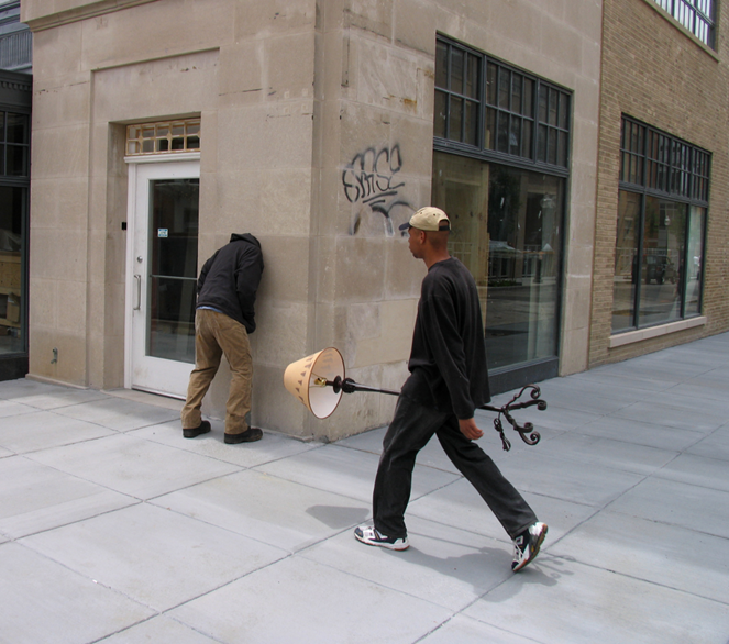
One artistic reference that I came back to a lot for setting up the scenes was the work of sculptor and street artist Mark Jenkins, who makes and dresses up people-shaped tape sculptures that interact and tell a story with their environments in surreal and interesting ways. In the game, scenes like these would often end up leading to or connecting with other scenes - creating little stories the player can see unfold as they explore.

http://www.xmarkjenkinsx.com/
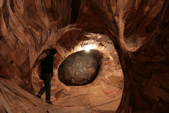
Coming back to this world for the sequel meant trying to subvert some of the style to find new interesting setups. One example is the (spoiler warning) deadly fungus infestation that has taken over one of the floors of the hotel you start on. It was created in Clayxels, a SDF modeling tool where you can mush together different blobs to create organic looking 3D stuff, the opposite of all the blockiness I had been working with at that point. An inspiration here was the work of the sculptor Henrique Oliveira, who creates wooden installations that look like a live infestation spreading through concrete structures. One special one for me was A Origem do Terceiro Mundo, from 2010, where I first saw his work in person and was able to walk around inside it. Luckily it was not deadly like our fungus.

http://revistacarbono.com/artigos/01desnatureza-a-origem-do-terceiro-mundo/
These would be just a couple out of so many influences. So much goes into making even a small game like ours that the truth is that it's often like the struggle and workload of hiking up a mountain mixed with the craziness and lack of real control of rolling down one. We grabbed on to our shared experiences and tried to keep the ship pointed in the general direction of something that felt special to us.
SLUDGE LIFE 2 is out and you can check it out at SHOPSLUDGELIFE.COM.
Read more about:
Featured BlogsYou May Also Like