Trending
Opinion: How will Project 2025 impact game developers?
The Heritage Foundation's manifesto for the possible next administration could do great harm to many, including large portions of the game development community.

Featured Blog | This community-written post highlights the best of what the game industry has to offer. Read more like it on the Game Developer Blogs or learn how to Submit Your Own Blog Post
After success with Killzone 3, the London-based motion graphics and design studio was once again asked to work with Sony Computer Entertainment and Guerrilla Cambridge in the creation of the fifth addition to the Killzone franchise – Killzone: Mercenary.

Co-founder and creative director David Sheldon-Hicks tells us about a typical day at Territory and how Killzone: Mercenary fits into that.
About Territory
Territory is a motion graphics and design studio with a reputation for creating stunning work across film, gaming and digital. Under the creative direction of David Sheldon-Hicks, film credits include on-set screen graphics for Prometheus, Zero Dark Thirty and Fast & Furious 6. Game credits include UI, in-game cinematics and trailers for Killzone, Little Big Planet, Medal of Honor and Murdered Soul Suspect.
In addition to UI work, Territory’s motion team works with a variety of creative briefs, including 2D/3D character animations, live action shoots - on location or in a studio, and branded content for commercials.
They have a broad range of skills in the studio to deliver these briefs: motion designers, 3D artists, developers, producers, live action directors, scriptwriters, art directors, typographers, designers, illustrators and creative directors. They work with a range of software, including Adobe CS After Effects and Cinema 4D, Maya, Final Cut, ZBrush, Vray and Unity.
A typical day
"There is really no such thing as a typical day at Territory. Some projects take just a few days, others take months, even a year, to finish; each day progressing the project a little further, crafting each minute detail.
We've recently been working on a feature film where we were based at the film studio as part of the art department. We'd go on set and be part of the filming, adjusting graphics on the fly. Seeing actors react to our work in real time is hugely rewarding and directors like it when actors can physically interact with the graphic displays.
To keep fresh and inspired, we take on creative challenges and self-initiated projects, such as the recent collaborative project arranged by Cut & Paste with 6 European animation studios. We each produced a 10 second character animation about a London superhero in just 5 hours! It obviously wasn't going to be a feature quality production with that amount of time so our team were extremely creative with the execution and had great fun in the process.
Our approach to creative cinematic and UI work also varies with the type of brief. For example, is the delivery a functional UI, part of a set dressing, or part of a cinematic?
Cinematics follow a typical narrative structure. The team plans out a detailed script first, being rigorous with directions for pacing, emotion, dialogue, etc., and then fleshes this out further in storyboards. At this stage we're thinking about framing, composition of elements, camera moves and storytelling. We then move onto creating animatics to work out transitions and timing of dialogue against action, before the polished animation stage.
UI for films is a completely different process. The narrative has been developed by the film director and it’s our role to find where a computer screen or hologram would serve a purpose in the narrative. Sometimes this is set dressing and we talk to the director of photography about mood, lighting and the director's intent for the scene. Other times we find that UI is being used to support the branding of a film, to add ambience, even to re-enforce a key narrative point.
In terms of workflow, our team is incredibly flexible. Sometime we handle one aspect of a job such as editing, other times we handle everything from sound design and script through to final DCP delivery for IMAX cinemas. We’re happy to work on site embedded with developers and film crews or at our studio in London."
Killzone: Mercenary brief
"The Killzone: Mercenary (KZM) brief was a perfect project for us, as it combined our love of UI and narrative. Telling stories using a high tech aesthetic is great fun and a form of escapism for the team; imagining future technology and using that to describe a science fiction space battle – it doesn't get much better than that! Mix that in with an amazing game franchise by a top developer and you have a very happy creative studio.
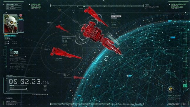
As we had previously worked with Guerrilla Games (GG) on UI and cinematics for Killzone 3 (KZ3), we were on familiar ground, which helped us work more effectively. We used the full extent of our production and creative team to deliver this job and everyone became extremely dedicated to the huge amount of work that needed to be delivered.
Still, there were clear differences in the KZ3 and KZM projects from the start, that added to the creative contrasts and challenges:
Firstly, KZ3 was designed for PlayStation 3, while KZM was being developed exclusively for PlayStation Vita – a handheld portable with a small 5” OLED display.
Secondly, KZ3 was the first in the series to be in stereoscopic 3D, while KZM was the first to be developed for the Vita.
Thirdly, the Killzone franchise has always maintained ‘blockbuster’ production values and it was critical that that was maintained on the Vita.
All this added up to a brief in which Guerrilla Cambridge (GC) and Sony Computer Entertainment (SCE) asked us to deliver UI and in-game cinematics that were visually rich, developed the plot, were true to Killzone’s UI language and felt seamless on the Vita.
The project included animated cutscenes comprising an intro, nine mission briefings, an outro, and eight weapon tutorials, plus the creation of opening logos and developer end-game credits."
Creative journey
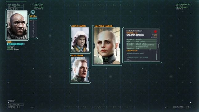
"With considerable creative challenges and high expectations, we sat down with GC’s creative director Piers Jackson, art director Thomas Jones and the in-game UI designer Matt Power, to review the script and loosely developed style sheet. The conversation at this stage was about the key plot scenes and the role they needed to play in developing the action. We also talked about the characters and familiarised ourselves with their personalities, as portrayed through the script and character art."
Narrative development
"As our brief was to develop the narrative, we immediately looked at how to really embellish and enrich the story to make the cutscenes fun and engaging for the gaming audience.
We began with scripts, 3D environment models, character concept art and some motion capture movie files, and developed the action from ther - storyboarding each cutscene and creating loose animatics. It’s a layered process that is developed through quick feedback and iterations, and because we didn't need to worry about the constraints of an in-game engine, we'd push further in certain areas - such as depth-of-field being used within the UI environment. We'd develop new looks and solutions when we’d encounter challenges and content that hadn’t been tackled by GC's UI team, such as video content presentation and transitioning from 2D map images into 3D projections of terrain.
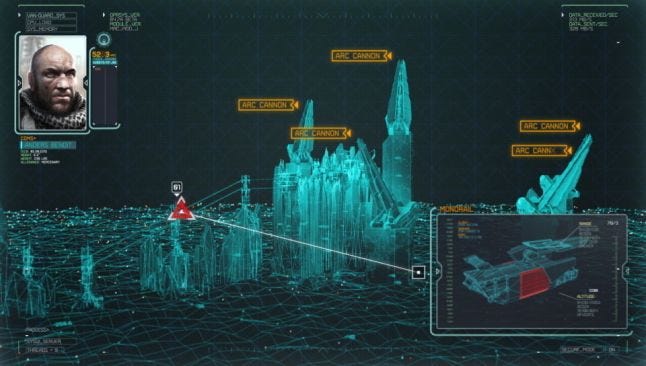
Story timings were extremely important to GC, so we worked closely with the rough cut voiceover files, ensuring key plot points were illustrated in synch.
As gamers, we were very aware of our responsibility to make sure that our work felt like a natural fit with the action and we worked hard to develop seamless transitions and mission briefings that felt relevant yet did their job to advance the plot."
Creative development
"Territory’s creative priority is to create a pleasing experience that is anchored in human authenticity. Our core audience is very technically savvy and have high expectations, so we need to balance plot development, entertainment, authenticity and consistency.
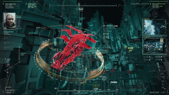
As Killzone is set in an off-world future, we spent a lot of time researching how to reflect this in the UI. The challenge was to create an experience that felt futuristic but was believable. For this project we looked at the latest ideas in interaction and military technology, specifically HUD’s from F16’s and Mig 29. We were fascinated by the aberrations that actually occur in these displays, and used these imperfections in our visuals for to enhance its sense of authenticity.
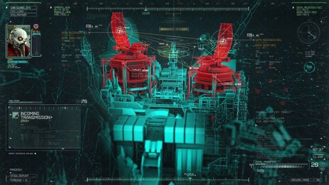
Technical wireframe animations were all created by Territory’s 3D team, including transitions and camera moves.
There were also a number of visual references to DNA strands. Luckily, Piers had an encyclopaedic knowledge of biology that informed some of the science behind the chemical/biological war aspects of the story that fed into visualisations that we created. Some of the DNA sequences appeared really sci-fi but were in fact based on textbook reality.
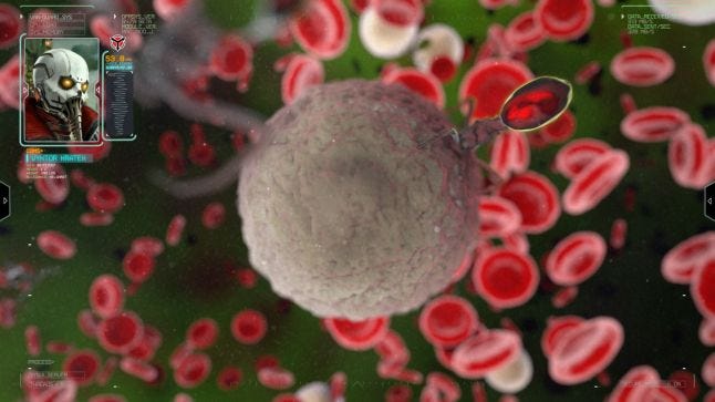
Finally, part of the creative process is to balance cool UI with key information and certain visual elements that have to be absolutely clear. Our motion graphic, UI design and film experience translates well into creating in-game cinematics because we are used to balancing aesthetics with information in quick bursts. In film, the on-screen graphics need to be seen and understood within three seconds. Applying this thinking to the Vita helped the team focus on effectively conveying essential information relative to key plot points."
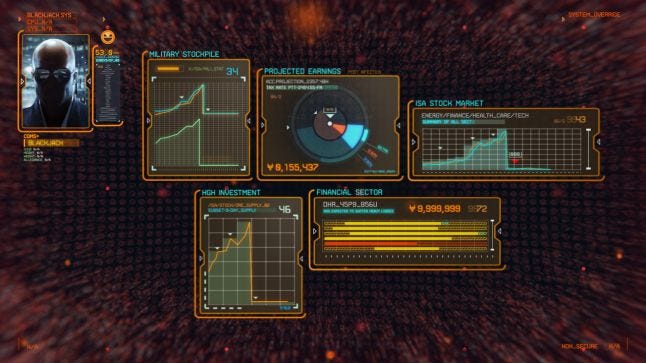
Vita challenges
"The first title in the series to be released on the portable PlayStation Vita, the creative challenges included UI design for a small screen.
To help us, we had a Vita in the studio and we spent some time experimenting with what worked best.
Compression testing was essential to creative development and GC worked hard to make sure we got the best out of it. We worked at the same resolution as the Vita screen and were gratified to find that compression technology was so good that our graphics all looked darker and richer on the Vita screen.
UI, typeface sizes and colour values were all closely monitored for maximum impact on the Vita screen, and while we didn’t have the same technical constraints as the in-game UI, our team had to ensure that what was created was in the same visual space as the Vita in-game menu.
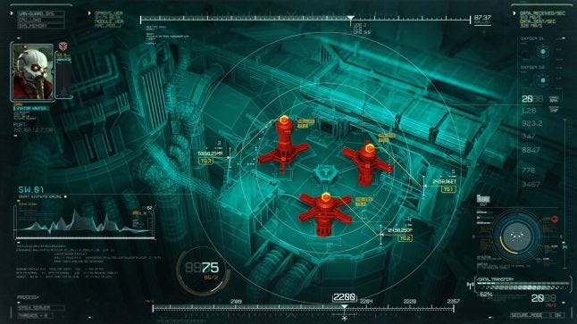
GC also asked us to give consideration as to how the UI changes throughout the gameplay; what stays on the screen, what disappears and if there should be an on-screen history. We delivered a style that ensured consistency of functionality and behaviour throughout the game. For instance, making sure that each UI window animation was consistent and followed particular rules dependant on the content it was loading in."
Collaborative relationship
"In terms of process, all sequences were created at the same time as the game was being developed, which resulted in a fluid process that required an intensively iterative approach as assets and UI were finalised. While challenging, the benefits of this approach were that we were able to contribute to UI development overall and with GC’s senior video editor embedded in our own studio, feedback was immediate resulting in a highly effective creative process."
Results
"Every one of the final in-game cinematics were richly textured narratives that maintained a sense of context and character and kept the increasingly complex story moving forward."
Credits
Guerrilla Cambridge
Game Director - Piers Jackson
Art Director - Thomas Jones
Graphic Designer – Matthew Power
Senior Video Editor - Simon Bastow
Senior Producer - Mark Green
Guerrilla Amsterdam
SCEE Creative Services Group, London
Territory
Creative Director – David Sheldon-Hicks
Senior Producer – Sam Hart
Animation Team – Jamie Child, Richard Coldicott, Jay Dingle, Gabor Ekes, Peter Eszenyi, Carl Fairweather, Mantas Gritaitis, Ryan Jefferson Hays, Nik Hill, Jason Moss, Jonny Ouellette, Jordi Pages, Raoul Paulet, Marti Romances, Sam Vacquier, James Wignall, Mike Wilson, Alasdair Willson
Read more about:
Featured BlogsYou May Also Like