Trending
Opinion: How will Project 2025 impact game developers?
The Heritage Foundation's manifesto for the possible next administration could do great harm to many, including large portions of the game development community.
I would like to share with Gamasutra community findings on large-scale redesign of our simulation games platform. I want to accent on the importance of feedback and suggestions from users, transform them into tasks for UX/UI design professionals.

To listen to consumers for eight months and to make a comprehensive UX/UI redesign - done!
UX design - to be or not to be?
CTIG spent on development $ 400,000 in 2016 and started operating margin. Business Games Club platform completed a comprehensive UX/UI redesign. Objectives for 2017 are to develop more flexible training platform through behavioral games (simulations). I mean including SaaS solutions, team gameplay and other innovations. It summarizes achievements and plans of our company.
Yet I would like to share with Gamasutra community findings on large-scale redesign of our simulation games platform. I want to accent on the importance of feedback and suggestions from users, transform them into tasks for UX/UI design professionals.

In 2015, we launched a startup with small budget, we didn’t use expensive designers. Our goal was to create working platform and see - is there any place to put it on the market.
While we managed monetization, first corporate sales and other business matters, our COO forced to fix user’s feedback. All reviews. From social networks to personal unfortunate users’ interviews. Those who installed the earlier application (all our games are played from a single app) and has shared contacts. Almost a year after the alfa launch, we have collected a lot of negative user experience, and ripe for redesign. But this time we had already filtered and hired a team of UX/UI designers from Odessa (Chapps Digital Agency). Their task was to create the most attractive and user-friendly interface on existing platform and analytics, to offer a new functional architecture, and to draw everything finally.
In 8 more months, we released updated version. Almost everything changed in it, if briefly. However, it became what we actually liked, and what our customers wanted.
The first and the most banal is fast start of application. I confess many users did not reach registration stage before, as they could not wait to run the app. Our engineers redesigned not only the program code, but also the principles of obtaining information from home server.
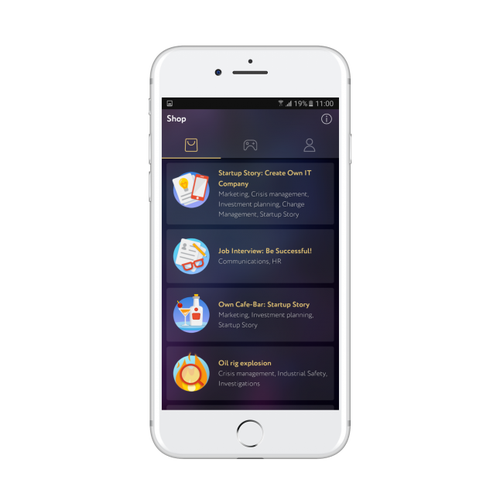
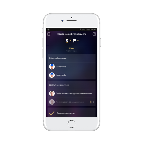
Though we keep minimum media in our games (for us text content is a king) exterior of games became modern, minimalistic and somewhat futuristic. And we’ve enriched them functionally: group election of reactions during actions filling is available now. As well as more elegant mechanics of plot branches, feedback window on what is happening in the world. New rich multimedia options are now available for embedding.
We introduced the option "notepad" in gameplay now. It allows to note important pieces of information and go back to them if necessary. It is especially useful in information rich cases, such as investigations or a job interview. Dialogues have more traditional design now. Style of modern messengers allows to understand conversations faster. Before, players noted interesting conversations and the fact that the game "retract", involve. And it is suitable for playing on go through mobile phone and tablet. At the same time, consumers spoke poorly about the usability and gameplay, game mechanics. And they said, "The toy at a level of the end of 90s. I "log in" for about 10 minutes. Registration form is too complicated, not intuitive".
There were also many complaints about hard to read fonts, especially for long texts. People remarked they would like to regulate font size. It is successfully implemented now.

BGC software developer Anton Kolyadin has been working with us since the very beginning and had already stick with the project. He says: "In fact we have not updated our application. We developed new product from scratch based on previous experience. I can name only store improvement conventionally redesign. But the main thing is cases that changed drastically. In the platform, if briefly, almost everything changed. And yes, the word "almost" can be removed from here. When I remind the first version of the game, and see the current one, I want to tell one thing to developers. Do not be afraid to change the product, to evolve, to kill forever old version! And no, you should not be sorry! Earlier, people, while opening our application, did not know what to do. We had to stand behind for the first time to explain everything step by step. Now every user opens and plays. When you have an experience (not only idea) not matter how sorry, terribly, hurt for spent resources. You should remodel all. And everybody will be happy of improvement".
Thus, as early as two weeks after complete platform restart the number of active users has doubled. And the number of orders for the development of customized products has tripled. Damn, the new UX/UI triggered even elderly captioned industrial Directors. Not to speak of modern HR-s.


Today we face a difficult choice – what "to cut on" brazenly. We understand benefits of promising B2C market, but want to create products for the corporate sector. Apparently, let us develop SaaS solutions and team gameplay. May be return to the idea of expansion into school education market.
I would be grateful for the comments of community members. Game design guru concentrate here, their advices, I'm sure, cost dearly.
Read more about:
BlogsYou May Also Like