Trending
Opinion: How will Project 2025 impact game developers?
The Heritage Foundation's manifesto for the possible next administration could do great harm to many, including large portions of the game development community.
In this Games On Deck article, legendary games developer Steve Wetherill (Jet Set Willy, Command & Conquer) concludes his discussion of the development of a one-button game, EA Air Hockey. Part Two discusses the AI and other aspects of development.

 [This is Part Two of a two part article, discussing the AI and other aspects of development of EA Air Hockey. Part One, discussing one-button design, can be found here.]
One-button AI
Early in development, the AI was quite a simplistic affair. It would pleasantly take shots back at you, without any real strategy or tactical analysis on its part. In fact, this played just fine, but it was decided that we needed to up the AI intelligence level so that those non-casual gamers could be presented with more of a challenge. It would have been easy enough to cheat and give the AI abilities that the human player does not have (in terms of positioning for shots, etc). However, I decided to "take the high road" and make the AI follow the same rules as the player (more or less). What I did was to make the positioning of the AI player's mallet 100% identical to the player. So, the AI mallet would do the oscillating arc movement, etc. This left just one problem to solve, "when should the AI take a shot?". What I did was to periodically calculate the result of an AI shot. The frequency of this evaluation was proportional to the smartness of the AI, and is one of the main factors between the three difficulty levels offered by the game. During the AI shot evaluation, various statistics are collected, obvious ones such as whether the shot is a scoring shot (or a home goal!), but also additional stats such as how many bounces the puck will take, whether the puck hits the other player's "goal line" and so on. These are then fed into the AI logic, and filtered using the current "mindset" of the AI, which changes according to a table of "moods" defined for each difficulty level. As an example, some AI moods dictate that only direct scoring shots will be considered, others that only indirect scoring shots will be considered, and yet others that appraise a shot positively if it merely hits the player's goal line. By stepping through AI moods, and using different tables of moods for different difficulty settings I was able to implement a scalable and challenging AI.
Referring to the AI moods - these are named "banker", "acer" etc in the source code as there was some initial thought to surfacing the AI opponents with characterizations, as has been done with other tables sports games (pool, etc). In the end, we did not go down that road, but it would make a nice addition if there's ever an Air Hockey 2.
One-button Gamesmanship
Gamesmanship is the act of "gaming the game". In other words, it is the use of tactics that exploit a weakness in a particular game's design to the advantage of the player. In this case, there was one such issue which pervaded the testing process - "button-mashing". It was discovered during the testing process that by "mashing" the button (ie, repeatedly pressing the button as fast as possible) it was possible to effectively block the AI. This did not give the player an unfair scoring advantage directly, but since the AI would not retaliate in this fashion (one possible solution was to make the AI button-mash in response, but that did not seem very satisfying), the AI was prevented from scoring and the random goals scored by the player while doing this resulted in player wins. It's an interesting problem, and it's something that would not happen in real life - if you were to employ this tactic against a human opponent, your opponent would simply slap you upside the head. This is generally borne out in EA Air Hockey's 2-player mode - not (that I've witnessed) the head-slapping, but the fact that humans tend not to try to game each other in the same way as they would with a computer opponent. With regard to the button-mashing, part of me felt that if a player wanted to game the game in this way (futile as it would be to do so) then so be it. But the another part of me felt challenged to address this. In any case, after a while the folks in QA were complaining so loudly about this "flaw" that something just had to be done. I ended up trying many different solutions, but QA proved very adept at poking holes in any anti-mashing defenses, so I just had to keep trying different things. In the end, the solution turned out to be in-keeping with the design of the game. What I needed to do was step back, and think a little about the "real" Air Hockey, and some of the physical realities of playing the game. What I realized is that when, in the real game, a player goes to make a shot from the center line, they will physically have their playing arm at full stretch. Accordingly, shots played from the center line (that is, shots that originate when the player's mallet is at or near the center line) will of necessity be lower-powered. This was simple to model, and fed nicely into the "shot strength" dynamic described above. The result is that button-mashing will still cause the player's mallet to hover around the middle of the table, and this will still potentially "block" the AI, but the resulting blocked shot will be very weak, leaving the AI plenty of time to counter, and get a shot past the player.
One Button Per Player, Two Players Per Game?
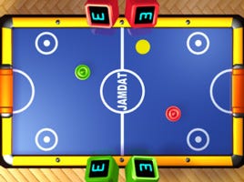
Two-player mode switches to a top-down perspective
where players controls one button.
When I started work designing EA Air Hockey, I'd been given a mandate by Zack Norman that the game must feature a two player mode. Initially, thoughts were along the lines of doing a split screen, with each player having his own "perspective" view of the the action. Ultimately, I implemented a top down view, which was more satisfying for a number of reasons. With the top-down view, I was able to orient the table sideways, so that two players could hold the phone between them. Then, to play the game, player 1 (at the right hand side of the screen) would use the ‘6′ button, and player 2 (at the left) would use the ‘4′ button. Each player has the exact same controls and in effect the phone is treated like a miniature arcade table.
One-button Final Thoughts
Here are some final thoughts on the completed game, some things that worked, others that worked out differently to my expectations, and details of a couple of features that did not make it into the game.
Intuitive controls
Although much time and energy was devoted to creating an intuitive control system, in practice there's one issue that people seem to trip over. The idea of pressing and then holding the OK button to take your shot seems to trip some people up. When the controls are explained to people, they understand it quickly enough, but people, especially non-gamers, seem to intuitively press OK and then immediately release the button. In retrospect, this is understandable because that's what you do in regular use of the phone, dialing numbers, sending a text message, etc. As a direct result of this, I ended up implementing a fairly extensive tutorial system which aims to train the player to hold the button down for longer shots. It was interesting just how much the use of a single button could be misinterpreted - but since there is only one button, it's really an all-or-nothing proposition in some ways!
Dropped game play modes
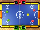
4-player mode was dropped early on,
but it might have looked like this.
As with most projects, some features were cut due to lack of time or space, or both. A couple of the more interesting (although possibly marginal in terms of additional value) modes were the 2 x players vs 2 x AI mode, and the 2 x players vs 2 x players modes. In principle, there's no reason why both of these modes can't be implemented using exactly the same techniques used elsewhere in the game, but there was just no time to include them in the game.
Leading development on BREW
I developed the game initially on the BREW platform, and therefore it was developed in native code (C++ and ARM assembler for some special effects). The game runs marvelously on BREW, and because you have raw access to such things as the primary graphics buffer and so on, you can squeeze every ounce of performance out of the BREW devices. When it came time to get the game finalized on the J2ME platform, it became clear that performance was going to be an issue. Ultimately, things resolved themselves in a fairly satisfactory way - we achieved the frame rates that are expected on the J2ME devices. That said, when the "expected" frame rate is 5 fps or less, you can imagine that the gameplay experience is going to be significantly different to that on BREW platforms which ran at 15 fps on all but one of the reference platforms (the VX6000 is well known to be a slug, and even that ran at a respectable 12 fps - though not without some hoop jumping it must be said!).
Creating art assets with a 3D package
One design decision I made early on was to create all of the in-game art assets directly using a 3D art package. The game uses sprites to display its perspective view of the table, and generating these with a 3D package provided a neat way to generate all the different sizes images needed to give the illusion of perspective movement. There were some issues with this approach, such as the edge aliasing problem that always arises when attempting to create 2D "sprites" using a 3D package, but those problems were overcome and we did in fact create 100% of the in game art using 3DS Max on all but some of the very tiniest screens. On some of the really small screens (the KX414 BREW phone for example) we applied some simple filtering to the output of Max, so it really was not an issue. The other advantage of using a 3D package is that generating assets for varying screen sizes is as easy as changing the render target size, and then adjusting a couple of constants in the code. In this way the game artist, Shaun Tsai, was able to generate the art for all BREW (from the 104×68 pixel KX414 up to the 320×240 pixel VX9800) and J2ME versions from the exact same art assets by simply rendering to the specifications I gave him for the various screen sizes needed. It's an approach that will not work well for all games, but for Air Hockey with its non-organic, solid game objects, this was ideal. This approach does also require that the game moves objects in a virtual space (not pixel space), and in fact, internally, Air Hockey tracks all objects in a virtual 3D coordinate space. I've even created a test version of the game that replaces the 2D sprite rendering with real 3D, though that's just a personal project at this point.
AI surprises
The AI evaluates all shots equally, it does not distinguish between offensive and defensive play - if there's a scoring opportunity while in defense mode, go ahead and take it! An interesting side-effect of this is that the AI us quite capable of bouncing a scoring shot against the player off its own back table edge (the goal line). It does not occur to frequently in regular play, but it does happen, and when it does it is quite intentional.
Rejected art
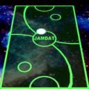
Vector style art sketch (I kinda like this one).
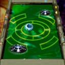
Flying saucer style art sketch.
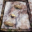
This stone age style looks cool -
the physics would be interesting though!
The final art for the game I think does a good job of representing the look of a classic Air Hockey table, garish primary colors are all the rage for the real game. We did create a number of other prototype art styles for the game (there was at one point some thought of unlocking these), which were rejected for one reason or another. I've included a couple of samples of these prototypes here.
Genesis of EA Air Hockey
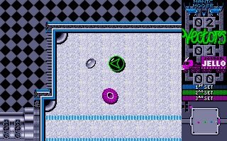
Projectyle on the Atari ST circa 1991.
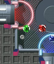
Projectyle prototype running on a mobile device circa 2003.
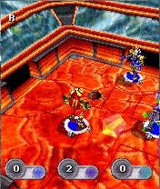
Projectyle prototype running in 3D on a mobile device circa 2004.
Although I give Zack Norman credit for the idea of doing an Air Hockey game, in fact the mobile game came about directly because of another game I designed and developed some 16 years or so ago. The game was Projectyle, which was published (ironically, as it turns out) by Electronic Arts for Atari ST and Amiga in about 1991. Projectyle was not a one-button game, and it wasn't that Zack had been a huge fan, or anthing like that (I doubt he knew it existed), but I had obtained the rights to the game from EA and as I've mentioned previously, there does exist a playable mobile version of the game. In fact, it was this version of Projectyle, running on a Microsoft Smart Phone as I recall, that I showed to Zack, this would be E3 2004, and it was Projectyle that peaked Zack's interest in developing an Air Hockey game with me. Projectyle (the original) was a three-player game (using keyboard and multiple joysticks) which I've described previously as a cross between Air Hockey and Subbuteo. The mobile version of the game supported bluetooth, three player multiplayer. The mobile versions remain unfinished and unpublished.
[Steve Wetherill has over 20 years of experience with video game technology and has developed on platforms ranging from ZX Spectrum to Xbox, including creating the lengendary Amstrad CPC version of Jet Set Willy. He founded Uztek Games in 2002 to focus on the mobile space. Uztek completed original mobile title EA Air Hockey for EA Mobile in 2006, and is currently working on several new mobile titles for J2ME and BREW. Steve Wetherill can be found at SteveWetherill.com.]
[This is Part Two of a two part article, discussing the AI and other aspects of development of EA Air Hockey. Part One, discussing one-button design, can be found here.]
Read more about:
FeaturesYou May Also Like