Trending
Opinion: How will Project 2025 impact game developers?
The Heritage Foundation's manifesto for the possible next administration could do great harm to many, including large portions of the game development community.
"The final art style is like a delicate paper world. Every visual element is there to help the player feel pleasant and comfortable, which is what we aimed for in the beginning."

This interview is part of our Road to the IGF series.
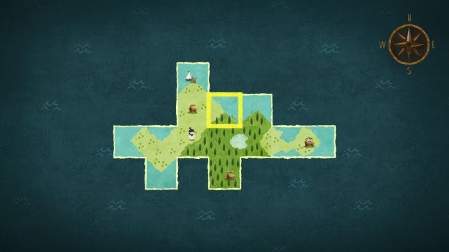
Carto, which was nominated for Excellence in Visual Art in IGF 2021, follows a lost girl using her cartography skills to get back to her granny. Part of this power is in rearranging pieces of the map, and in doing so, rearranging the world to change her way home.
Gamasutra sat down with Lee-Kuo Chen, Director of Carto, to talk about the challenges that come from creating puzzles that reshape the entire world, the thought that went into the game's visual design, and the ways in which that design reshaped the game once the developers chose it.
We are Sunhead Games, a Taiwan-based independent game studio founded in 2012. I’m Lee-Kuo Chen, director and game designer of Carto. Besides me, there are 3 other developers on our team: programmer Chia-Yu Chen, artist Kuan-Hung Chen, and sound designer Eddie Yu. We also worked closely with Nick Suttner as our writer and business developer on Carto.
Prior to Sunhead Games, I had two and half years of experience with another game studio as a programmer. Then, as a studio, we made two mobile titles: A Ride into the Mountains and The Swords. Carto is our third title and our first on PC and consoles.

The gameplay mechanic came first. That was the only thing I wanted to deliver in the beginning, and didn’t consider other things like narrative or art style for a long time.
As for the idea of tile-placement, it came from the popular tile-placement board game genre, especially Carcassonne. I was introduced to the game around 2005 and I’ve always enjoyed it. For the idea of swapping map tiles to solve puzzles...I actually can’t remember where the idea came from! I’ve had a design notebook for years to keep my random ideas. One day, I found a line that said “Like Carcassonne, but you are able to travel on the tile you place.” It sounded promising so we started prototyping it. It worked well immediately, so we kept developing it.
Unity, Photoshop, Spine, FMOD, and lots of graph papers (for making paper prototypes of the map tiles).
I didn’t know, actually. I just felt like I didn’t see any other games with this game mechanic, and it seemed cool at first glance. It had tons of possibilities and it felt great right away, so we wanted to dig into it to see how far we could go from there. As for the rest, I feel like it designed itself.

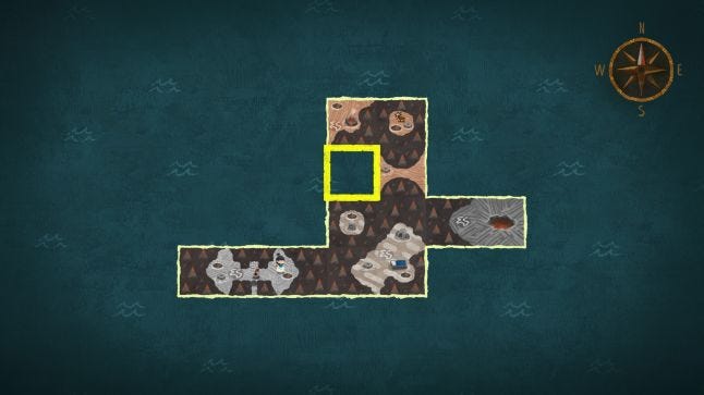
Creating puzzles was easy at first because the design space was totally open. Though afterwards, when we started thinking of the story, art, and sound, we realized the real challenge. As you can see, the puzzles are tied to the tiles, and the tiles comprise the entire world. That means that if you want to change a puzzle, you have to change the world! Making art for the world was very time-consuming, so we had to be very careful about what we changed; once the art was done, there was no going back! So, if we wanted to improve a puzzle we had to find other ways to tweak it. Phew! I’m glad it eventually turned out okay.
We wanted players to be able to have a sense of discovery by traveling to new lands, to feel the joy of satisfaction by restructuring the world, to be amazed by the puzzles, and to feel happy by experiencing a small but delightful story.

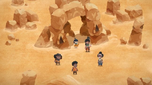
The first idea was trying to combine different styles like collage, map illustration, screentone and puppet animation together, to see what it would become. We tried a few different variations, and discovered that they were too complex. Eventually, we found this sort of semi-watercolor style that made the visuals look soft and relaxed, so we decided to go with that direction. The final art style is like a delicate paper world. Every visual element is there to help the player feel pleasant and comfortable, which is what we aimed for in the beginning.
In our case, the art style grew alongside the game and its theme. Before the artist joined the team, the game was all about the puzzles and a few silly jokes. After he joined and the art style was set, we felt that the game needed a proper story to do justice to the art. Then we started taking the narrative part seriously. In retrospect, the art style totally changed the direction of the project.
You May Also Like