Trending
Opinion: How will Project 2025 impact game developers?
The Heritage Foundation's manifesto for the possible next administration could do great harm to many, including large portions of the game development community.
The team behind the iOS and Android port of downhill freerider Descenders break down how they created the title's touch controls.
August 17, 2022

Author: by Jay Fernandes, director at Plastic Fern Studios
Game Developer Deep Dives are an ongoing series with the goal of shedding light on specific design, art, or technical features within a video game in order to show how seemingly simple, fundamental design decisions aren’t really that simple at all.
Earlier installments cover topics such as UI and difficulty levels in Cook Serve Forever, the challenges of programming for 2D for Sweet Transit, physics-based animation in Gibbon: Beyond the Trees, and designing spatial inventories in dark fishing sim Dredge. In this edition, Jay Fernandes, director at Plastic Fern Studios, discusses how the company designed and implemented controls for the mobile port of PC and console title Descenders.
I’m Jay Fernandes, the director for Plastic Fern Studios, which is a fully remote game studio founded in 2018. I’ve been in the video game industry for almost 14 years and have worked on games for mobile, to indie, to AAA and have (for almost the past 8 years) worked with many developers on porting, QA, release management, and even SFX or music. Some projects I’ve been a part of in recent years include Hades, Superliminal, SkateBIRD, Firewatch, the Playdate console, Escape Academy, and the mobile ports for Descenders (I probably have close to 100 games I’ve helped with in some capacity at this point).
The main contributors to the touch controls and how they currently work were:
Sunder Iyer -- UI/UX Programmer for Plastic Fern Studios. Previously at AAA studios and worked on South Park The Fractured But Whole and The Sims 4. Came up with various input schemes and produced mockups, documents, and iconography. Also playtested and provided feedback along with Jay given that both of us have UX backgrounds.
Bryan Alvarado – Friend of Jay’s for as long time and Technical Director at 502 Studios, a game studio based in Guatemala, working on games and related interactive fields for 10 years, releasing their own games and also collaborating with other companies and studios on their own projects. They have been recently working on 502's Arcade, their debut game for Steam and Nintendo Switch, and most recently the mobile port of Descenders. He worked on refitting the UI, implementing controller support, integrating some of the platform specific features, doing overall bug fixing.
Oscar Morales -- Generalist Programmer at 502 Studios. Before joining the company, he had been making independent games and his last known project was Ultra Zultra. He's also an organizer of GameDevGT, a Guatemalan game developer community. Worked on implementing the input schemes and mockups as well as optimizing the game to fit the platform requirements and improve performance.
We were lucky enough to work on the iOS and Android port for the amazing Descenders game which also included the challenges of trying to make a game that works so well on PC and Console feel just as good on mobile. We knew there would be challenges since it needed to perform well, have multiplayer, and was a fast-paced game that could have issues translating to touch controls or small screens, but by far the thing we spent the most time on was the controls and UX during gameplay. Luckily, with the help Sunder, and our friends Bryan and Oscar from 502 Studios (Who helped immensely with the porting), we were able to come up with a new touch control scheme that felt natural, and matched with the fast paced fun of the other platforms.
For those not familiar with the game, the game includes a lot of controls from acceleration/braking, steering, leaning, bending/pumping, and tons of tricks so we knew from the beginning it would be a massive challenge to try to fit everything on a touch screen and still have it be understandable, playable, and fun (especially for veterans who we asked for feedback from throughout the process to make sure it would “work”). It was very important for us to make sure that both new and advanced players could perform simple and complex actions (especially in harder levels) to match their playstyles.
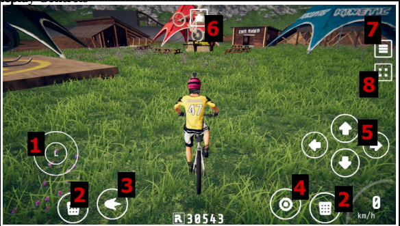
We experimented with a lot of different layouts. I mean a lot. Like even more than you’re thinking. Gamepads' bumpers and triggers (L and R buttons) present a challenge when porting controls to touch screens since typically you don't have these shoulder buttons and in many games, these can modify the action of the face buttons or analog sticks. A typical solution to this is un-rolling the modification such that the combined input is presented as a unique button on the touch screen. This is acceptable in some games where a single action might be modified into only one new action but in our cases, Descenders' Trick button (RB, R1, R etc) could be combined with the right analog stick to perform 8 different tricks so unrolling a directional input into 8 unique buttons would lead to a cluttered on-screen UI.

An experimental button layout that proved too complex
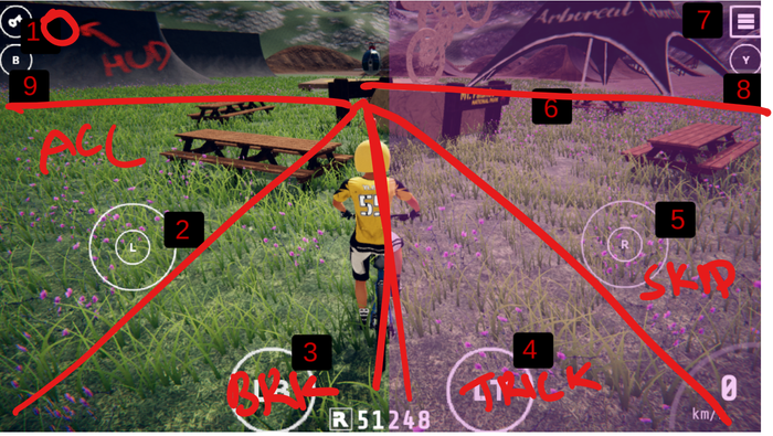
Sunder played with the idea of having an extra on-screen touchstick for just performing tricks or having two touch spots for the right touchstick such that one would initiate carving/tweaking while the other would perform tricks. He then proposed splitting the screen into quadrants such that dragging in certain zones on the screen would produce specific behaviors.

The quadrant experiment
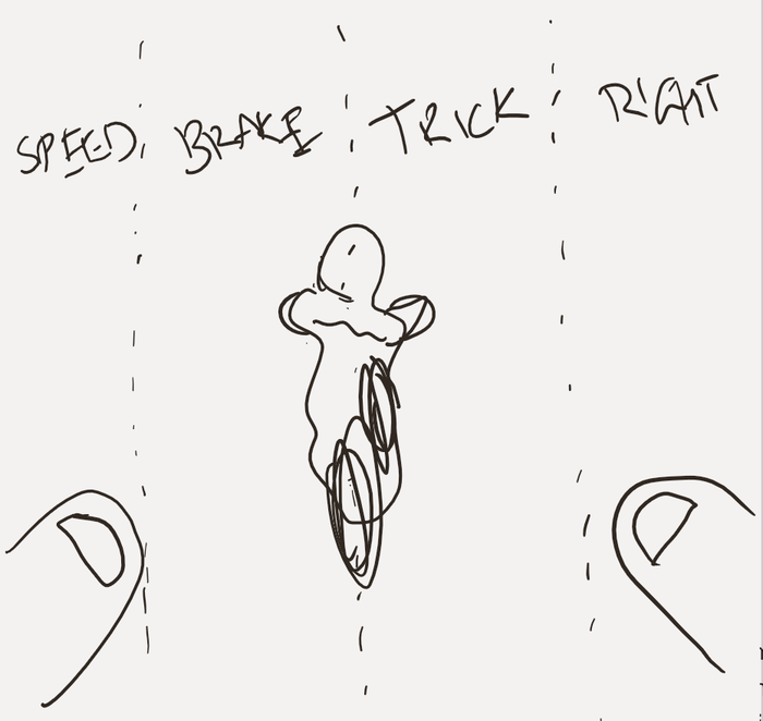
The original proposal was to split the screen into four vertical slices, the left stick would only work on 1st and 2nd slice which represented acceleration and braking and the right stick would only work on the 3rd and 4th slice which represented trick and carving.

An sketch showing the vertical slice concept
We went back and forth a few times and after playtesting and fine-tuning, we eventually settled on a variation of this idea where we had an on-screen zone for acceleration and one right below it for braking. That said, we also had a lot of experimental approaches as well, just to see how they felt.
We tried other layouts like having the sticks accelerate when pushed forwards and stopped when tilted back but it presented some issues when trying to perform higher-level maneuvers on more difficult courses (which, truth be told I’m terrible at but luckily testers and No More Robots could provide us with experienced player strategies). A lot of layouts also worked in theory but felt very different than the established game so we trashed them.
All of the designs technically "worked" (you could control the game with them, but some definitely felt worse than others). This is where our design and UX backgrounds probably came in the strongest since we were able to discuss with everyone what the goals and needs were, look at the constraints of the platform, and then design and implement a control scheme to best include everything and have players feel like they are playing something familiar (especially if they’ve played it before) but also not feel like it’s overly complicated to master.

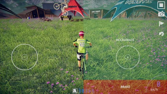
The final iteration of Descender's touch controls on mobile
The hardest part was actually that multiple people liked different layouts but we had to ultimately decide (and sometimes convince) on what the mobile players would initially experience. I think a common misconception with porting or developing for specific platforms is that just figuring out “how” to make something work is the hardest part when a lot of times it’s actually pretty easy to get multiple solutions working and the hardest part is deciding collectively which one is "best." We had a lot of different ways to play the game, but holistically some of them were just a bad fit or would cause issues later for players, so we tried to recognize these problems (on top of usual technical/development issues) to come up with a touch control scheme that could do all of the things Descenders does so well.
The decision led to the current scheme, which includes the least amount of elements on screen we could do (essentially just 2 joysticks) and still feels like the actual game. Taking a complex moveset and making it work comfortably on touchscreen is very difficult and it would have 100 times easier to come up with a simplified touch scheme but then, the game won't be Descenders, it would be something else. The final scheme works something like this:
Two zones on the right side of the screen which represent acceleration and braking - they can be visualized with a setting and will display green and red overlays on top
You use the left touch stick on the left side of the screen to steer and lean
You use the right touch stick to slide as well as pump/counter-pump and bunny hop.
While in the air, the right touch stick can be flicked in different directions to do tricks (this was the hardest thing to figure out how get to work well).
You can also move the right touch stick on the right side of the screen over the accelerate and brake zones for finer control while carving/sliding.
In the end we think it works pretty well and hopefully players enjoy it too! (otherwise, it also supports controllers!). Even though this was one of many problems solved in bringing this game to mobile (you know besides networking, performance, or device issues) I think it’s the one problem that had the most care put into it, has a lot of invisible work that went into it from all sides, and is arguably one of the things that would have the most impact on players since controls that feel weird or broken would definitely not be ideal for such a fun game coming to a new platform.
You May Also Like