Trending
Opinion: How will Project 2025 impact game developers?
The Heritage Foundation's manifesto for the possible next administration could do great harm to many, including large portions of the game development community.

Featured Blog | This community-written post highlights the best of what the game industry has to offer. Read more like it on the Game Developer Blogs or learn how to Submit Your Own Blog Post
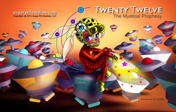
Nine design iterations on the touch interface that ultimately shipped with the game Twenty Twelve.

Twenty Twelve is my first game as a full-time indie developer, and it is now available on several platforms: console (XBox360), browser (Silverlight5), desktop (Windows), and mobile (Windows7Phone). Each of these platforms makes use of different primary input devices: gamepads, mice, keyboards, and touch screens. Designing a touch interface for Twenty Twelve proved much more difficult than I originally anticipated. This post documents nine design iterations on the touch interface that ultimately shipped with game Twenty Twelve.
I designed relatively minimalist controls for Twenty Twelve, in an attempt to ease porting between each of the target platforms and input devices. The game’s protagonist (Serena) moves left and right, she pulls levers, activates robots she’s lined up with, moves through doorways, and occasionally speeds up time (think down-arrow in Tetris). With a bit of experimentation, I found that Serena’s actions mapped nicely to four keyboard buttons: left, right, activation (both levers and robots), and advancement (both through doorways and time). On a gamepad, the analog-stick or directional-pad controls movements left and right, while the A and X buttons are mapped to activation and advancement. Using a Mouse, Serena walks left or right toward the cursor position, leaving the two mouse buttons to trigger activation and advancement.
Twenty Twelve Controls: Movement, Activation, and Advancement: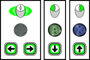
Icons representing these controls in the touch interface diagrams below:
When starting this project, my naïve understanding of touch interfaces essentially equated them to single button mouse interfaces. Supporting this view, the XNA framework automatically converts touch inputs into simple mouse events. I was peripherally aware of problems related to hands blocking players’ view, and of virtual buttons lacking tactile feedback. Still I didn’t anticipate problems porting Twenty Twelve to use just one more input device. If you haven’t yet played Twenty Twelve, now would be a great time to download the trial (on Windows or XBox360), and consider what kind of touch interface you would design for it: http://sugarpillstudios.com/games/twentytwelve/.
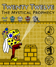
Design #1
My first touch interface for Twenty Twelve closely followed the mouse controls. The protagonist always moved toward your finger while it was in contact with the bottom half of the screen. The activation-button was invoked as your finger first made contact with any part of the screen. And the top half of the screen served as a virtual advancement-button.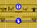
While testing this interface, I typically held the device in one hand while sliding my index finger across the bottom of the screen for movement. This felt accurate and responsive, and kept players’ hands from blocking too much of their view. This setup also enabled a two handed holding-posture where the players’ thumbs comfortably hovered over the lower left and right corners of the screen. Touching the screen with either thumb moved Serena toward that thumb as each thumb were triggering its own virtual button.
My biggest problem with this interface was that every time you return your finger to the screen, an action is triggered. This results in many false positives, where the game registers actions that the player never intended. The next couple of interface revisions focus primarily on this problem.
Design #2
To reduce the false positives from Design #1, I replaced the first-contact activation control with a tap gesture. This tap gesture only triggers activations after short duration touch contacts. While eliminating false positives, this gestural control introduced an even worse problem of lag. Timing actions is an important part of Twenty Twelve, and tap gestures just didn’t provide enough temporal precision.
Design #3
In an attempt to reduce both false positives and lag, I tried assigning a multi-touch gesture to the activation-button. While dragging your index finger to control movement, a second finger anywhere on the screen invoked the activation-button. This felt much more like a mouse by allowing movement with one finger, and clicking with a second finger or thumb. Unfortunately, keeping one finger touching and one finger hovering above the screen was very fatiguing for players. It was hard to play more than two or three levels in this posture before feeling compelled to shake cramps out of your hand.
Design #4
One more variation on Design #1 involved inverting the activation trigger, so the activation command was triggered when your finger left the screen instead of upon first contact. While initially less intuitive, I preferred this control scheme over those previously described. In a sense, touching the screen signified that you were preparing to align an activation, and removing your finger then triggered that activation at the precise place and time you had planned. There were still some false positives when players reposition their hands or withdrew to contemplate solutions, but this interface provoked far fewer false positives than Design #1. In addition to its counter-intuitiveness, this interface also made it difficult to perform rapid series of activations. This prevented me from being able to beat some of the later levels in Twenty Twelve.
Design #5
One of my early visions for Twenty Twelve’s touch interface was much more context sensitive. In this interface, touching a stone robot triggered an activation response, and touching your avatar or any door triggered an advancement response. In terms of movement, your avatar still walked toward all touch contacts for as long as they were held down.
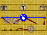
The main problem with this interface was that players’ hands blocked too much of the screen while playing. Since the doors were usually near the top of the screen, they were particularly problematic.
Design #6
With a sense that there was just too much happening on the screen, I received some good advice to try making use of the other Windows7Phone sensors. In particular, I mapped the player’s movement to the device’s rotation (around an axis running from the top to bottom of the screen). When the device was rotated, the player moved toward the side turned away from the player, otherwise they stayed put. The activation and advancement controls were presented as virtual buttons covering the left and right halves of the screen respectively.
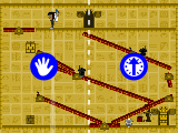
Part of the problem with these rotation controls may have involved balancing their sensitivity. However, I think the bigger difficulty stemmed from the players’ inability to sense how much rotation they were applying. This was in stark contrast to how well we can sense the position of a mouse beneath our hand. On the positive side, the activation and advance buttons were very precise and comfortable.
Design #7
The next design implements four virtual buttons arranged in the four corners of the screen. Starting in the upper-left corner and working clockwise around the screen, the buttons include: activation, advancement, move right, and move left.
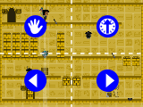
This interface was very comfortable and intuitive. The problem with this interface was that it made moving left and performing activations mutually exclusive. Your left thumb could either move left, or perform an activation, but it could not comfortably do both at once. This interface also made moving right and advancement mutually exclusive but that’s a rare combination for players to attempt in Twenty Twelve.
Design #8
You may recall how moving toward touch contacts (ala Design#1) could be effectively used like virtual buttons. This interface reverted the left and right movement in Design #7 back to the Design #1 scheme of always moving toward touch contacts. It became clear in this design iteration that holding posture was making a big difference, so I decided the correct usage was holding with one hand and controlling with the other.
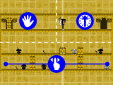
This interface shared the drawbacks of several earlier designs. Using one hand to move between movement controls and activation introduced lag similar to Design #2. The other problem with this control scheme was that players’ controlling hands significantly blocked their view while preparing activations and advancements. This was similar to the difficulty encountered with Design#5. Oddly enough the mutual-exclusion problems of Design #7 did not seem as severe while using one hand.
Design #9
To address both the lag and view blocking of Design#8, this design stacks the activation and advancement buttons vertically and within reach of the holding-hand’s thumb. Actually, these virtual buttons span the width of the screen to enable both left and right handed holders.
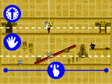
This is the interface design that Twenty Twelve is shipping with on Windows7Phone. It’s far more usable than the previously described designs, but not without problems. My biggest concern is that the correct holding posture may not be communicated clearly enough players. A secondary concern is that fingers do occasionally occlude game objects around the edges of the screen, although this rarely happens.
Conclusion
Despite functional similarities, there are important differences between mouse and touch interface designs. Porting games to run on touch interfaces requires special attention to unique issues (like how a mobile device is even being held). In iterating on Twenty Twelve’s touch interface, I feel like I’ve been exposed to some common classes of touch interface problems. While staying mindful of these issues, remember that when designing user interfaces, there is no substitute for player testing and feedback.
Read more about:
Featured BlogsYou May Also Like