Trending
Opinion: How will Project 2025 impact game developers?
The Heritage Foundation's manifesto for the possible next administration could do great harm to many, including large portions of the game development community.
Professor Cadbury and the Candy Castle was developed by a team of six developers in over four-hundred man hours. This postmortem is a summary of the what went well, what went wrong, and lessons learned through the project’s development.

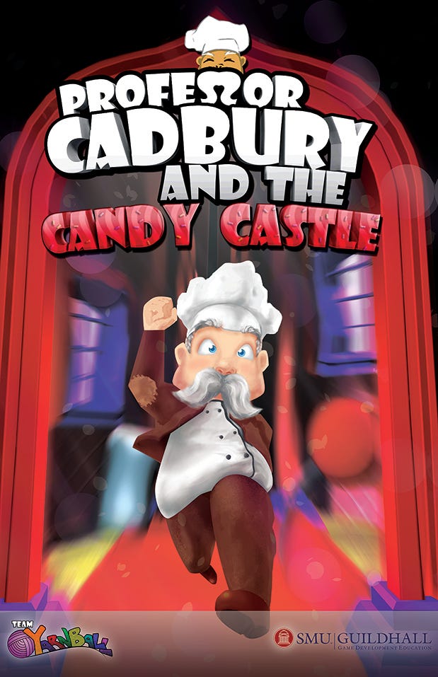
Professor Cadbury and the Candy Castle was developed by a team of six developers in over four-hundred man hours. In the game, the player control Professor Cadbury, confectioner extraordinaire, as he races through his castle, jumping and dodging candy spikes, to save his cinnamon buns from burning. The game is a 2D side-scrolling platformer that utilizes a sugar rush mechanic that either speeds up or slows down the player. This postmortem is a summary of the what went well, what went wrong, and lessons learned through the project’s development.

Figure 1: Promotional Poster by Chris Laboy
What Went Well?
Personality
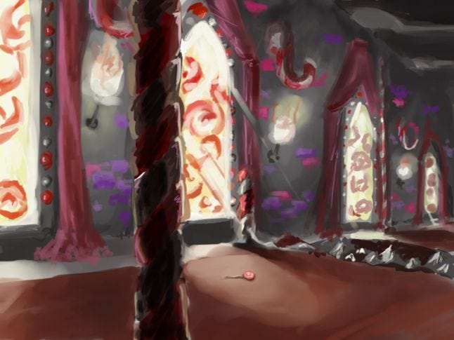
As its name implies, Professor Cadbury and the Candy Castle takes place in a castle filled with confections, and all aesthetics of the game reflect that theme. From the colorful and playful art style, to the quirky soundtrack and poems, everything in the game had a consistent through line. In every playtest session, the aesthetics of the game always garnered praise. This is all thanks to our talented artist, who went above and beyond his required effort to ensure the game’s art is of the highest quality.

Figure 2: Environmental Concept by Chris Laboy
Programming to Level Pipeline
Professor Cadbury and the Candy Castle features a sugar rush mechanic, which speeds up or slows down the player character’s movement speed based on the amount of candy consumed. The game also features wall jumping, which after initial testing was found to be difficult to implement with the current physics engine. To get the character movement, wall jumping, and sugar rush feeling just right for the player, our programmer worked tirelessly to quickly get these mechanics up and running. He then worked closely with the level designers to get the friction and player jump to feel just right. The open communication between programmer and level designers allowed us to adjust the implement new systems and changes quickly and efficiently.
Scoring System
Form its coin collection system to its timer system, every mechanic in Professor Cadbury and the Candy Castle fed into a scoring system. The scoring system would give the player one to three star rating based on his performance and offer quotes that corresponded to the player’s rank. By tying all mechanics to the scoring system, we added a new level of challenge for the player and increased replayability of the game. The system allowed the player to attempt to beat their high score. In fact, our development team created a scoreboard in the office listing the high scores, and it became a fun activity for each member to top the highest score.
What Went Wrong?
Initial Scope
Professor Cadbury and the Candy Castle originally had a whip and swing mechanic, melee combat, and nine enemy types. Given the short development time for the project, the scope is absolutely tremendous. This bloated scope lead to gross underestimations of many tasks. We soon discovered that the amount of work required to incorporate all the aforementioned features is far beyond any member’s limit. Up until the proof of concept technology milestone, our designers, programmer, and artist were working overtime to get all of our deliverables done. This led to high stress, low morale, and a build that is not very fun. Luckily, we caught our mistake of scope early and were able to trim away many mechanics and find the core fun of our game, which was the sugar rush, running, and wall jumping. These cuts to the game were ultimately beneficial to the project, as it help us deliver a focused product.

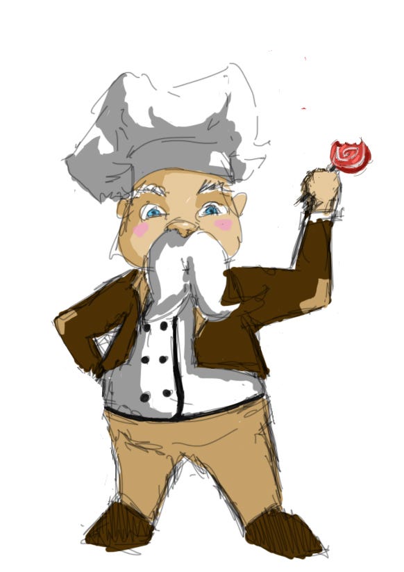
Figure 3: Character Concept by Chris Laboy
Fractured Game
While the sugar rush mechanic was fun at times, the level designers each had different ideas of how the sugar rush should be implemented. Initially, some designers saw the candy that powers the sugar rush as a way to control the player’s speed and movement, while others saw the candy as simply a collectable. The different interpretations of the sugar rush mechanic led to inconsistent levels and player experiences. Because of the different implementation of the sugar rush mechanic, the player could not establish the function of the mechanic and elected to ignore it all together.
We eventually overcame this problem by creating a level design bible detailing how each asset in the game should be placed. The level design bible helped us regain consistency in our design, but the redesigning of the level cost us precious development time.
Art to Level Design Pipeline
While the programing to level design pipeline was very clear, the art to level design pipeline can at times be a little confusing. There are times where our artist would finish a batch of assets, but failed to inform the level designers that he has completed the tasks. This caused level designers to create builds with old, unpolished assets and led to delays in integration, because the level designers had to reimport the new assets and rebuild the level using the new art pieces.
Lessons Learned
The Designer’s Mindset is Often Different from the Player’s Mindset
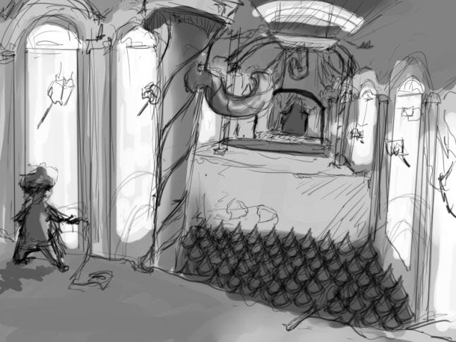
Through our weekly playtest sessions, we discovered a common trend: players do not like to play the game as we intended them to. What we thought were clever puzzles turned out to be frustrating to the player, and strategies we thought were effective completing certain levels were rarely utilized. Luckily, our frequent playtesting of the game allowed us to find these design flaws and rectify them in a timely manner. For future projects, we need to think more from the player’s perspective when designing our levels.

Figure 4: Environmental Concept by Chris Laboy
Design Together
As mentioned before, different interpretations of the sugar rush mechanic led to a fractured design in levels. Aside from the level design bible, we found that holding weekly design reviews for the levels were incredibly helpful for the level designers. These design reviews achieved a number of positive effects. It kept the level designers informed on each other’s work, and made sure they shared a central vision for the design of the levels. Furthermore, designing together in these review sessions also helped the level designers in bonding with one another by giving them the channel to communicate openly about their thoughts and ideas.
Read more about:
BlogsYou May Also Like