Trending
Opinion: How will Project 2025 impact game developers?
The Heritage Foundation's manifesto for the possible next administration could do great harm to many, including large portions of the game development community.
Project Island is a survival RTS built at the Guildhall@SMU. This postmortem represents the what went well, what went wrong, and the lessons learned during the game's development.

Project Island is a 3D survival RTS game that places the player in control of three crew members who crash lands on a seemly abandoned planet. The crew must journey through the hostile environment, while managing limited resources and their life support systems, if they want to escape the planet. The game is one of the most ambitious projects undertaken at the Guildhall@SMU, taking the efforts of 15 members and over 7900 man-hours to complete. This postmortem covers the what went well, what went wrong, and the lessons learned through the development of Project Island.
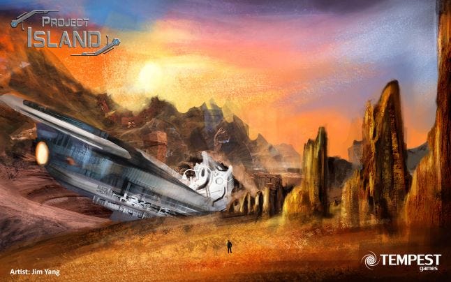
 Figure 01: Concept art by Jim Yang
What Went Well:
Implementation of Game Systems
Project Island was the first survival RTS game made at the Guildhall. This style of game created many challenges, one of which is the vast amount of systems that had to be created. Our programmers had to build a fog of war system, a drag drop inventory that communicated between the game world and Flash, a mini-map, and custom blocking volumes for AI pathing. All of the aforementioned features were coded in Unreal Script, since we did not have access to the source code of UDK as students. In the end, our team is extremely proud of what the programmers have made. Project Island is one of the most technically impress games at the Guildhall.
Willingness for Team to Listen to Feedback
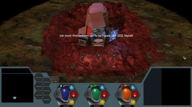
Project Island did not have a smooth preproduction. The large amount of systems that had to be implemented for the project, coupled with our inexperience in designing content for an open world map, meant that our early milestones were not as successful as we wanted them to be. Many of the feedback criticized the game of not having enough interesting content and that the game world feels bland and uninteresting, largely due to a predominately-green color palette. Luckily, our team was willing to listen to many of the harsh feedback and was able to improve the gameplay and aesthetic for our alpha milestone. The changes we made to Project Island ultimately served to benefit the fun and quality of game.
 Figure 02: Screenshot of game during vertical slice
Final Art Direction was Well Received
As mentioned earlier, the initial color palette of Project Island was criticized of having too much green. As one professor at the Guildhall@SMU pointed out, the game looked like the Pacific Northwest, and not an alien planet. While our artists did not have enough time to remodel all the assets, they were able retexture our fauna with a color palette consisting mainly of blue and indigo. Emissives and slight panner effects were added to the planet leaves to give them a bioluminescent feel. By Alpha, the game’s world looked completely different, and the changes were very well received by everyone who played the game.
Figure 03: Alpha screenshot of game
What Went Wrong:
Lack of Clearly Defined Vision Early in Development
One of the issues that affected Project Island’s preproduction was lack of a clearly defined vision. Other than our core pillar of survival and resource management, we did not have a clear idea for how all the systems will interact with each other. We knew we wanted to have multiple crew members to manage and hostile environments to battle through, but we did not give enough thoughts to the design of the enemies and the layouts of each area. As a result of unclear vision, the early iterations of Project Island contained bland gameplay and was unable to hold many people’s attention. Resources and food items were scattered around a large map, but there was nothing driving the player from one area to the next. It was not until later that we found out that the thrill of discovery was a major contributor to the enjoyableness of our game. We added more story nodes and interesting locals for the player to visit, and distributed the game’s assets in a more compartmentalized way; these changes ended up giving the player purpose and made gameplay more enjoyable.
Lack of Communication between Departments
The communication between departments was poor during the early milestones of Project Island. Incorrect assumptions about what each department was doing were made, which lead to bottlenecks and assets that were difficult to reuse. Some of the communication issues stem from the unwillingness of team members to criticize the works of other members. The fear of criticizing others resulted in problems that were not addressed until after milestone reviews. After our vertical slice milestone, the team had a large meeting where we reexamined our communication pipeline. Fortunately, the team was able to recover, and communication improved for the subsequent milestones. In the end, we learned that a lot of development could be saved if issues were brought up quickly, which will in turn give us more time for polish.
Not Enough Playtesting
Project Island had a large number of game systems, from the health and damage values of hostile creatures to the cost of resources to craft items and level up characters. The amount of systems and complexity of their interactions demanded ample time for balancing. However, due to the aforementioned setbacks in preproduction, we did not have enough time to playtest the game. We held a few usability and playtesting sessions, all of which benefited the game greatly, but they were not enough for us to hit our desired balance. Ultimately, we got Project Island’s balance to approximately 80% of where we envisioned. More time allocated to playtesting would have gotten us closer to our targeted balance.
Lessons Learned:
Never be Afraid to Reexamine the State of Your Project
Sometimes, it can be difficult to look at your failures, but it is always better to confront your sort comings and progress from your current state. On Project Island, we were able to take a hard look at our game and listen to the harsh, but correct, criticisms, and make appropriate adjustments. Game development is iterative, where we learn from our mistakes and improve. It is often through mistakes and failures that we experience the most growth. Project Island is a great example where the team recovered from early mistakes and came together stronger at the end.
Firgure 04: Screenshot of swam environment in final build
Open Communication is Extremely Important
Open communication can often make or break a game’s development. Because game development moves at such a rapid pace, issues that are not brought up and addressed immediately can often have lasting consequences. This was one of the most valuable lessons we learned from Project Island. It is better to let someone know the flaws in their work than to conceal it from them. Being transparent about the issues of a project is crucial to getting problems fixed in a timely manner. Many of Project Island’s issues could have been resolved if there was more transparency in development.
Scoping Down a Project Is Not Simply About Cutting
In a complex game like Project Island, where numerous systems depend on each other for balance, cutting a feature does not always reduce the workload for the team. We discovered that if we cut one feature, many of the game’s systems would be affected, which resulted in many hours spent rebalancing the game. To scope a project correctly, we must identify the core experience of the game, and allocate sufficient time to complete and polish the core gameplay. To identify the core experience of a project, we must establish the vision early on, whether it is the gameplay minute or the backstory. Scoping a project is just as much about creating a concrete vision as it is about prioritization of features and tasks.
Read more about:
BlogsYou May Also Like